Konsept & kampanjer | Grafisk design | Print Design
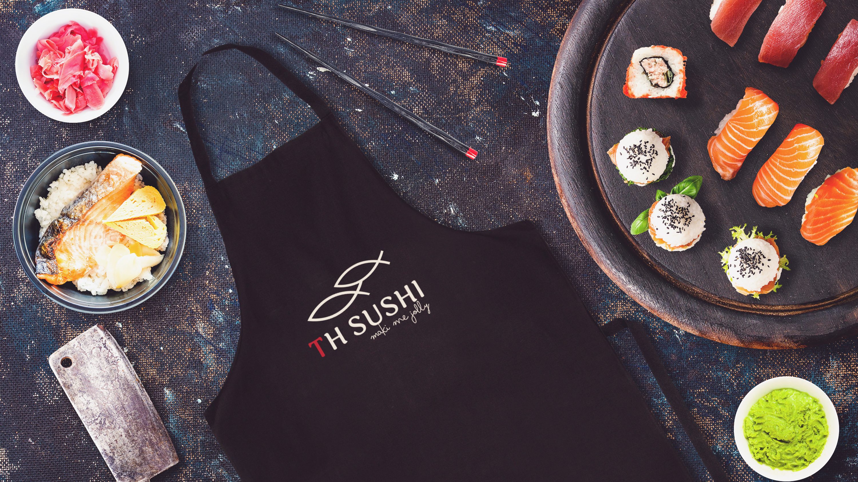
TH Sushi
TH SUSHI is among the popular sushi restaurants locally in Haugesund, open since 2019. They are quickly taking hold of the food market here, and the new trend of eating clean and healthy. Here is their page on Facebook: https://www.facebook.com/THSUSHI.
Target Market
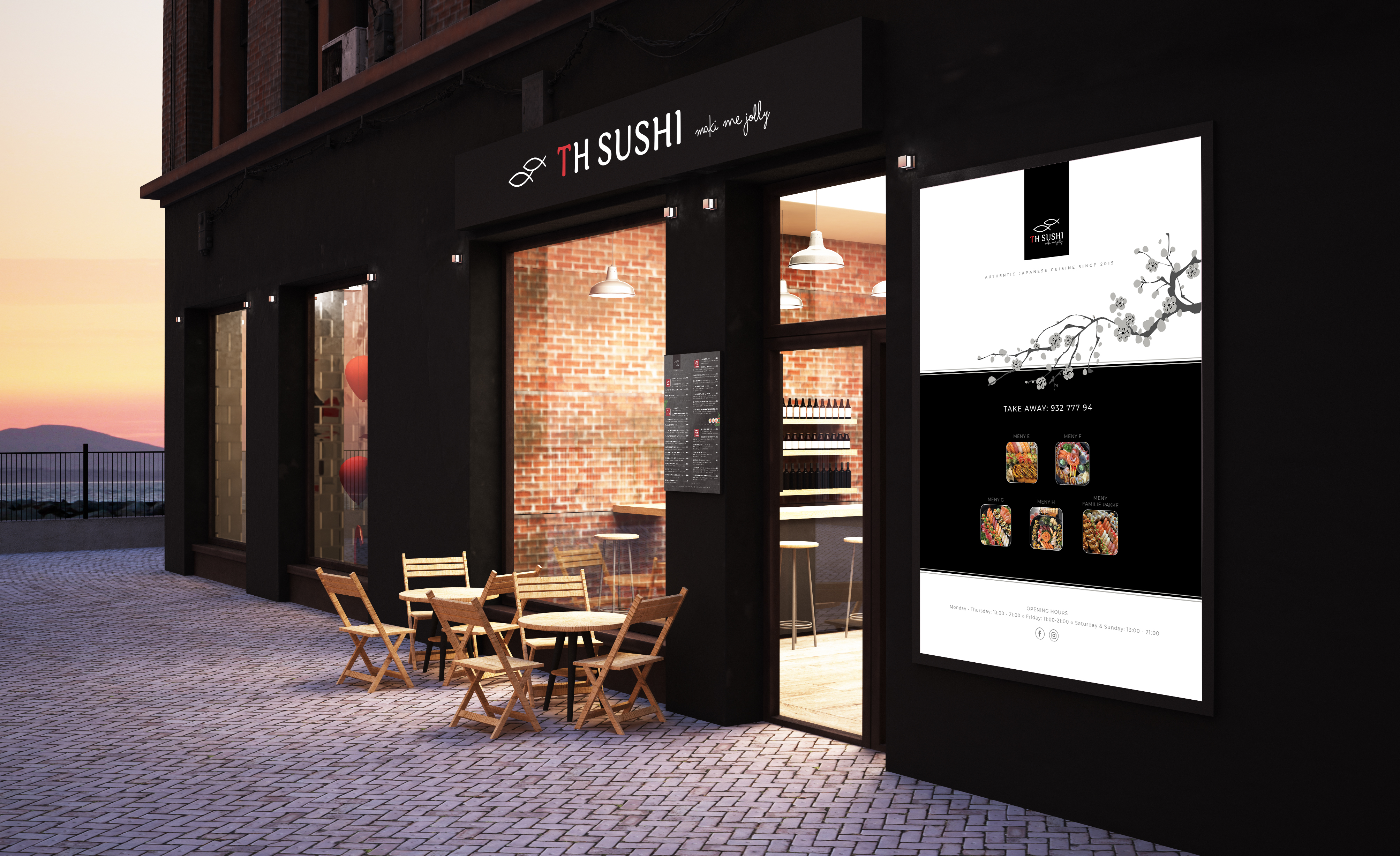
The goal is to bring TH SUSHI not only known to locals for the quality of its sushi, but also to be closer to the tourists who come to the city every year.
This is the banner that was redesigned for the exterior window. This banner targets the taste of the guests with the delicious menu images that draw their attention and at the same time redirect them inside.
Visual Identity Design | Logo Design
The logo is simply designed based on the idea of sea fish such as salmon, tuna and other fresh seafood – this is one of the main ingredients for making famous sushi from Japan.
The illustration (symbol) is two fish representing the owner of the restaurant. The small fish is the image of the wife who stands behind to support all needs, while the husband (the bigger fish) is the chef – the heart of the restaurant.
Color palette: Focus mainly on the customers’ impression of the restaurant – a cozy place, a genuine experience, good food and good service. Based on the design concept, these colors black, red, and white are best suited for Japanese sushi brand. They help to reinforce the passion of the mouth-watering taste, premium, fresh, trust and loyalty.
#FFFFFF
RGB (255, 255, 255)
CMYK (0, 0, 0, 0)
#D3242A
RGB (211, 36, 42)
CMYK (11, 99, 96, 2)
#000000
RGB (0, 0, 0)
CMYK (40, 30, 30, 100)
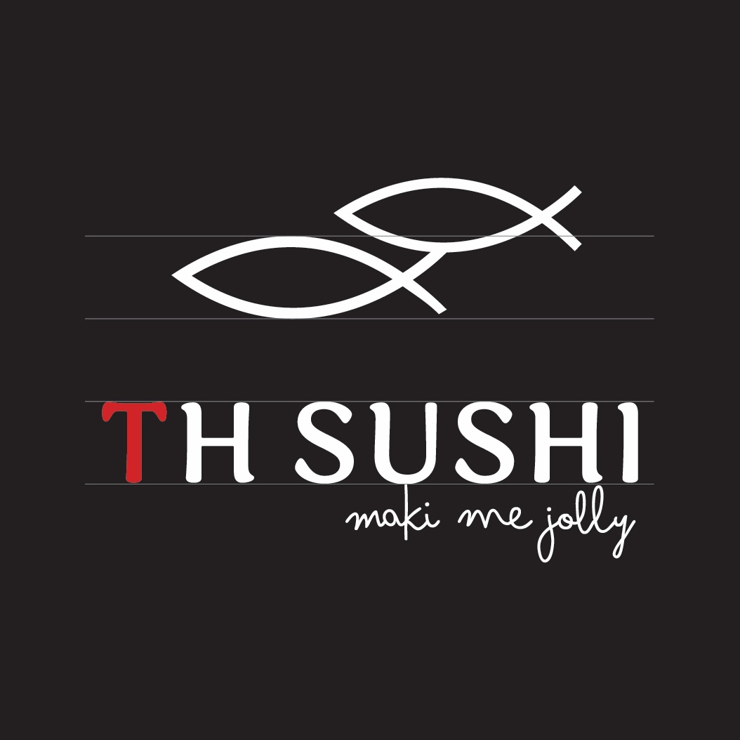
The slogan “maki me jolly!” from the original “make you happy!”. At TH SUSHI, always make customers feel satisfaction, comfort and enjoyment when they visit the restaurant. The word “maki” is the name of the traditional sushi roll. This is also a popular pun in advertising design.
Typografi
WORD MARK
Sirenia (sans serif)
Regular – Kerning 50
TAGLINE
Bimbo Pro (sans serif)
Regular – Kerning 0
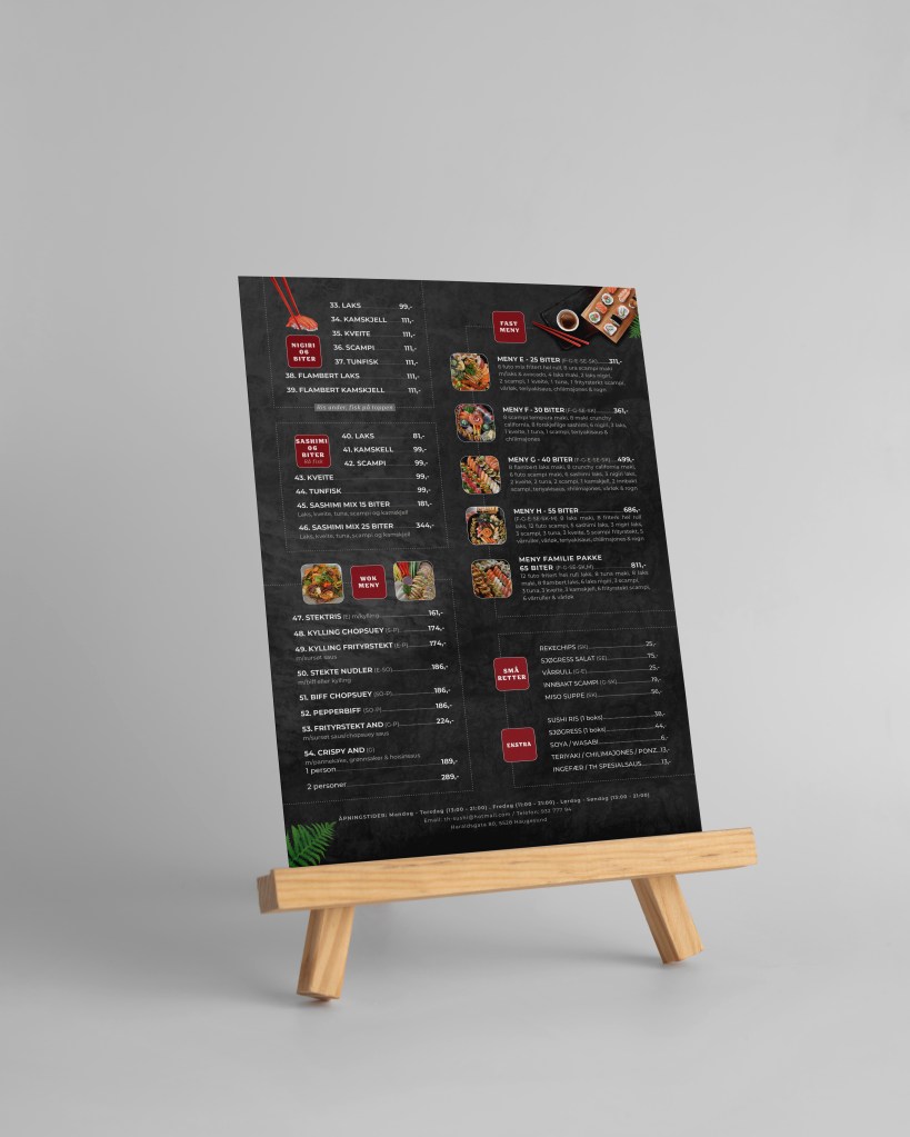
Visual Identity Design | Meny “in-house”
After the corona pandemic, TH sushi wants to develop on-site dining services instead of just serving take-away like before. They wanted an eye-catching 2 menus designed to impress viewers. The menus should have both images and text.
The background of the design is inspired by the black stone plates used in most sushi restaurants, including TH Sushi. The dark design concept creates a clean and premium feel. The in-house menu has 2 pages, is designed in A3 size on a luxurious, hard matte paper.
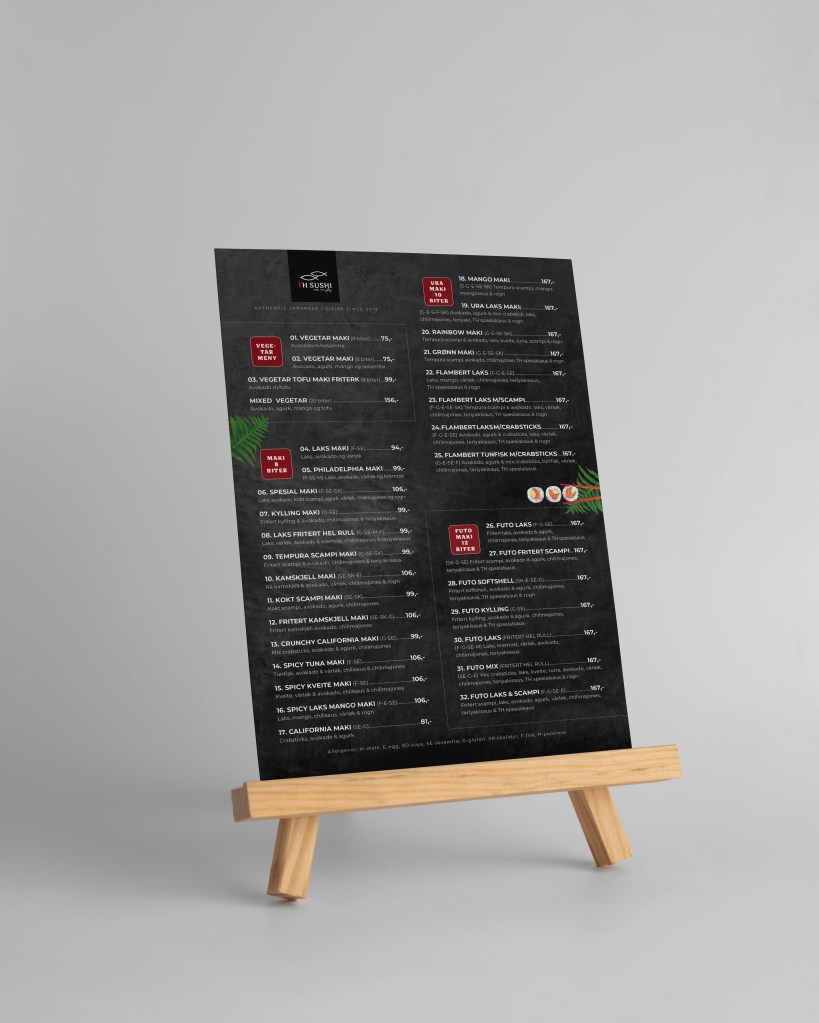
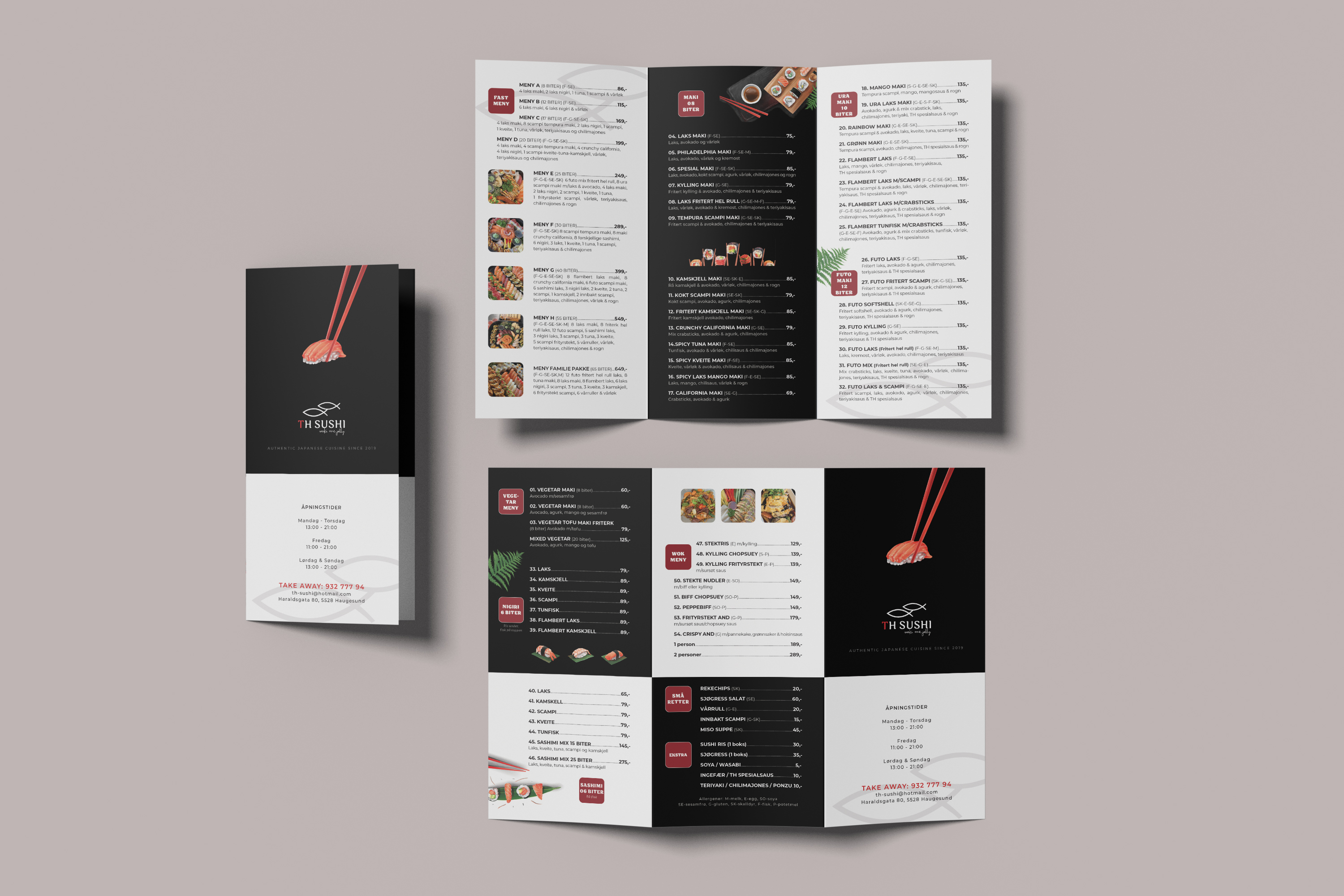
Visual Identity Design | Meny “take-away”
The design concept is a mix of black and white tones to create a sense of luxury, quality, and contrast to reduce boredom for viewers. The take-away menu is designed in three parts (A4 size) on a luxurious, hard matte paper.
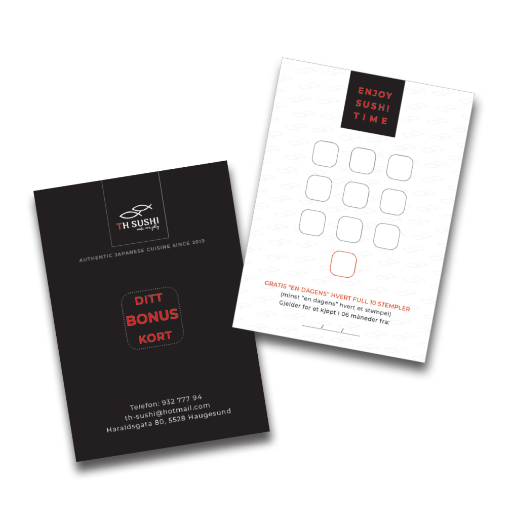
Business Card & Bonus Card
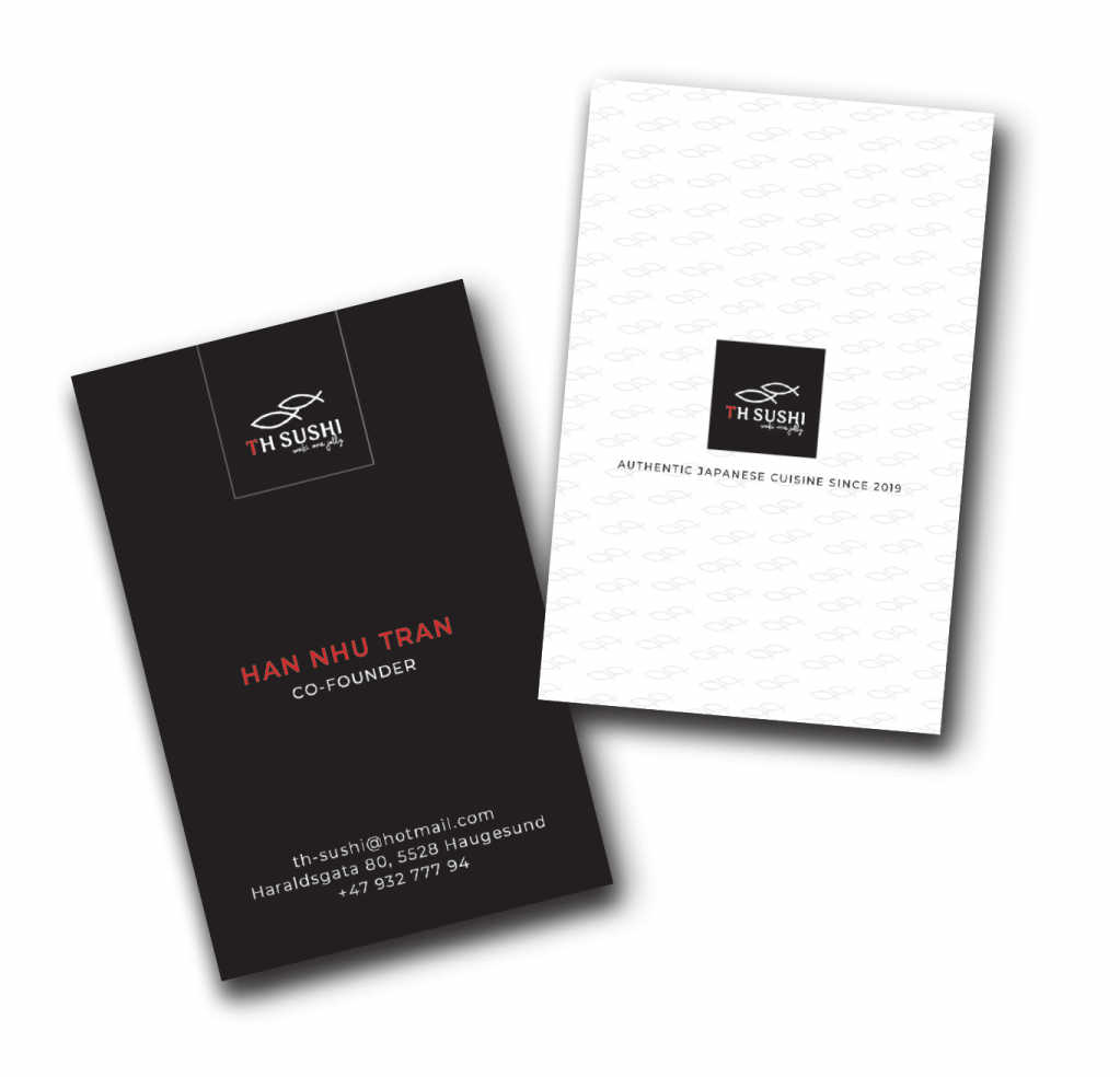
During the design process, TH sushi wanted to have an image that stood out from its competitors and wanted to confirm its position in the hearts of its customers. Wanting to bring customers only two words: Quality and Good Service.
