UX Design | Case Study
OKALPHA’S CONTACT PAGE
Overview
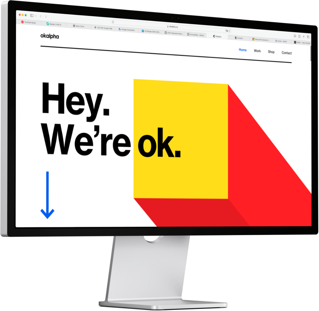
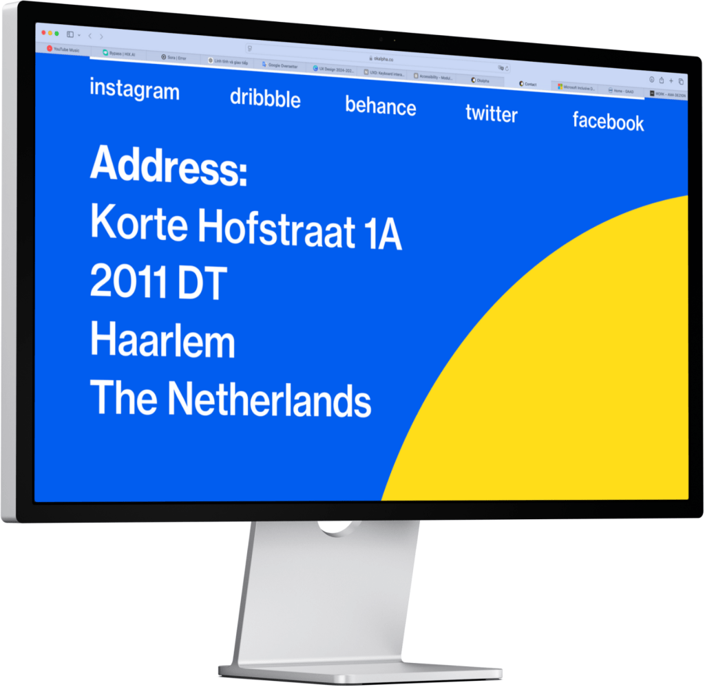
Okalpha’s current contact page provides essential contact information, including their email address and physical location, but lacks an interactive contact form.
Integrating a well-structured, accessible contact form can enhance user engagement and streamline communication.
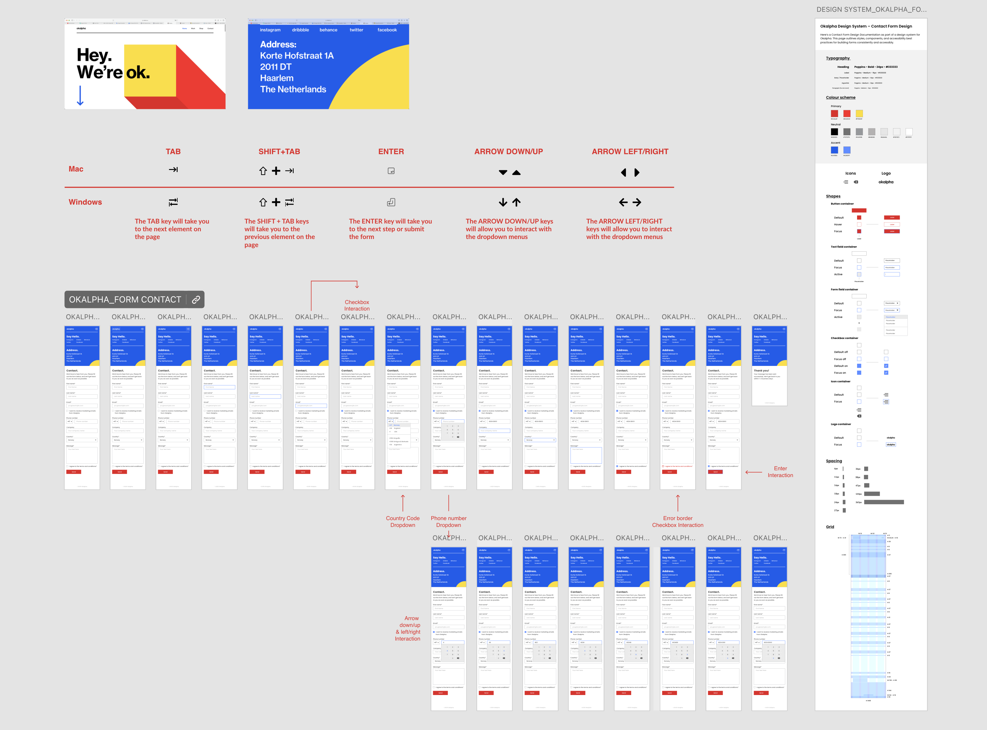
The next pages is a proposed high-fidelity mockup of the contact page featuring the new form.
My Role
I was responsible for designing a high-fidelity mockup of the new Contact Page for Okalpha, replacing the static layout with a fully interactive form. My focus was on accessibility, usability, and visual hierarchy.
Key contributions included:
- Designing a well-structured form with logical input order: Name -> Contact Info -> Message -> Permissions.
- Ensuring adequate color contrast for readability and accessibility.
- Implementing clear keyboard focus states (blue 2px outline) for all interactive elements.
- Making the form fully keyboard-operable with visible tab order.
- Including key fields: Name, email, phone, company, message, checkboxes, dropdown, submit button.
The result is a form that is clean, accessible, and aligns with modern UX best practices.
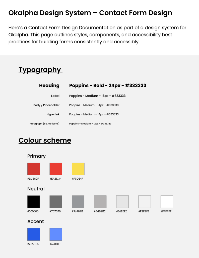
My Role in Design System Documentation
As part of the project, I created a Form Design Documentation page for Okalpha’s design system. This page is a foundation for consistent, accessible form design across the product.
Accessibility Best Practices
Supports users with low vision or color blindness.
- Label Association
- Use <label for=”field-id”> and id=”field-id” to link labels and inputs.
- Enables screen reader compatibility and better UX.
- Keyboard Focus State
- Use visible 2px blue border (#265BE6) for all focusable elements.
- Allows keyboard users to track form navigation visually.
- Color & Contrast
- Minimum 4.5:1 contrast ratio for text vs. background.
- Buttons use white text on red (#D3362F) for strong readability.
Conclusion
This assignment allowed me to apply UX and accessibility principles in a practical design task. By redesigning Okalpha’s contact page, I focused on creating a user-friendly form that is fully accessible by keyboard, logically structured, and visually clear.
The project improved my understanding of form design patterns, keyboard navigation, and high-fidelity prototyping, while reinforcing the importance of inclusive digital experiences.
References & Sources
- Nielsen Norman Group. (n.d.). Form Design: 10 Rules to Simplify User Input: Link
- Google Material Design. (n.d.). Text fields – Components: Link
- LinkedIn/Accessibility Web Design – Labeling Forms: Link
- Okalpha official website: https://www.okalpha.co
- Adobe XD prototyping – Contact Form Page: Link
- Adobe XD prototyping – Design System: Link