UX Design | Case Study
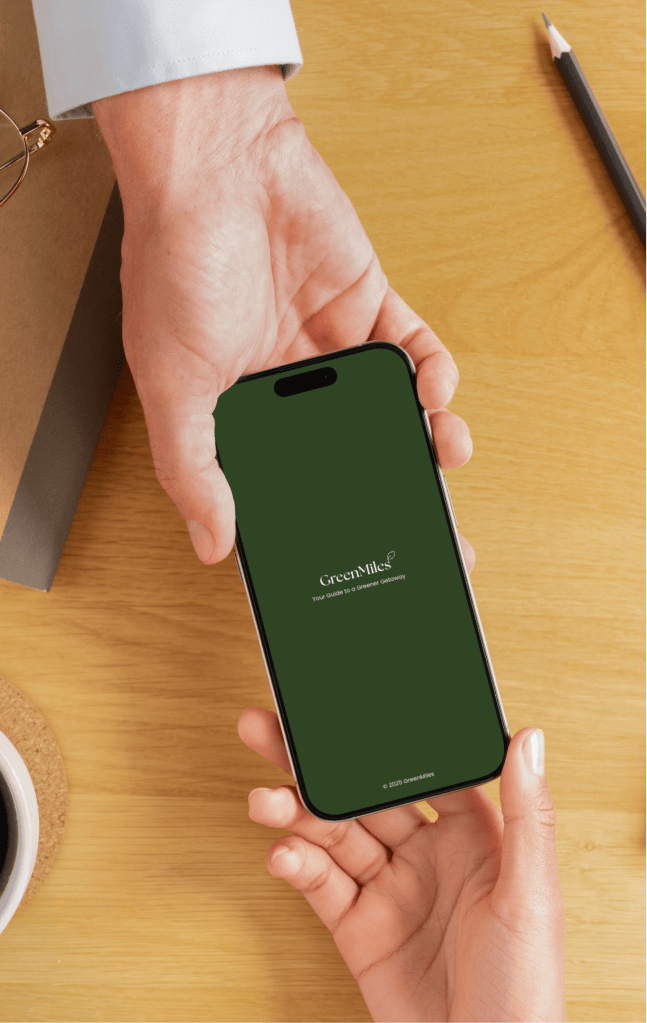
GREEN MILES APP
The Sustainable Travel Platform
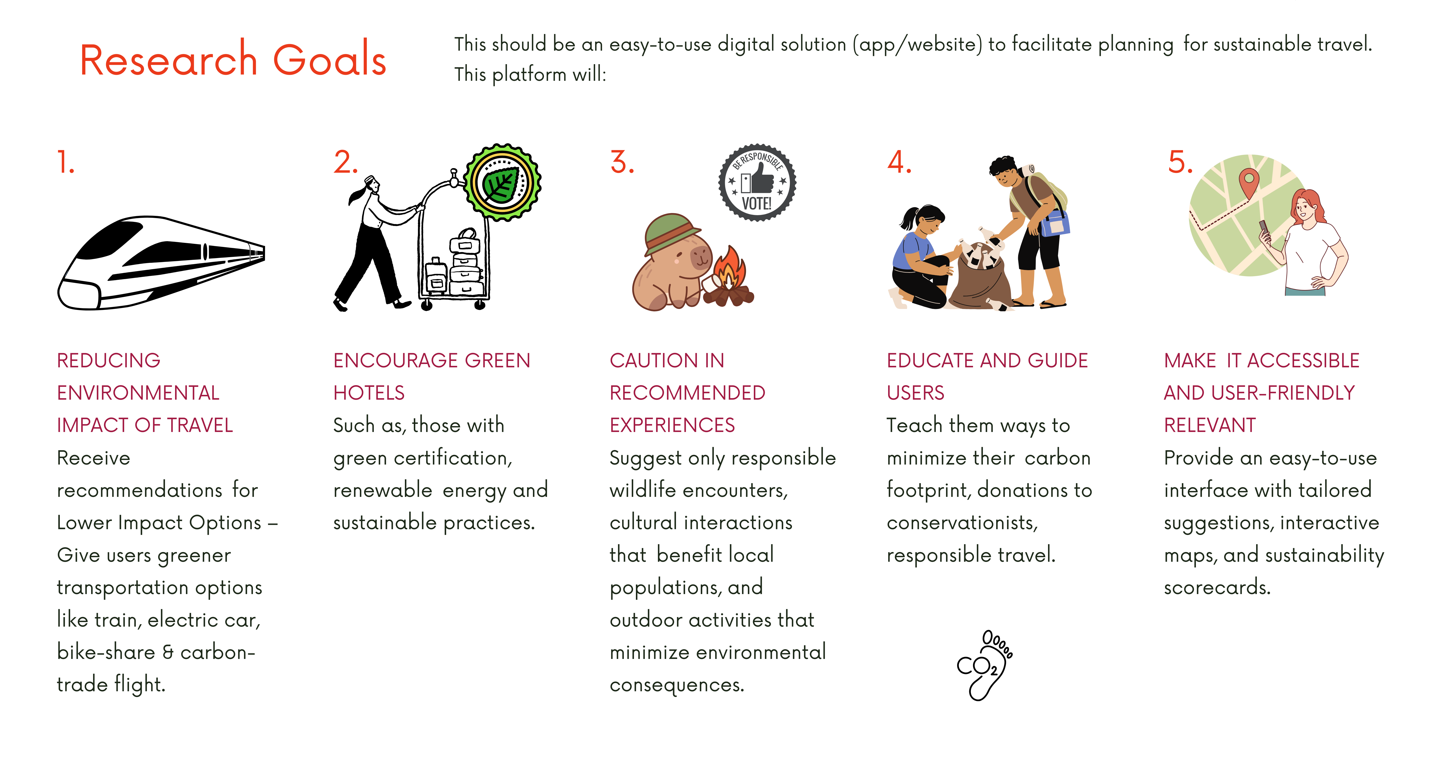
As climate change and sustainability issues are becoming more alarming, eco-friendly travel solutions are gaining popularity. But planning an eco-friendly trip isn’t always straightforward.
This project will help promote travel without harming our planet by creating a functional, easy-to-use app or website to help people make low-impact transportation and e-co camping/ lodging decisions, as well as greener things to do and find while traveling.
This platform combines both technology, user experience design, and conservation efforts so that you can learn how and what choices to make to help better the environment and communities we visit.
It does not just inform but turns awareness into real-world impact, ensuring travel remains sustainable for future generations through its intuitive design and actionable recommendations.
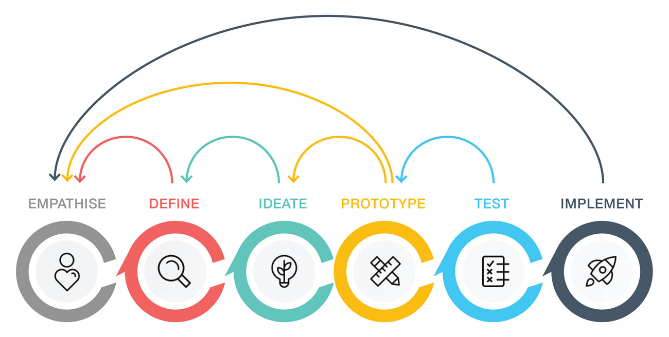
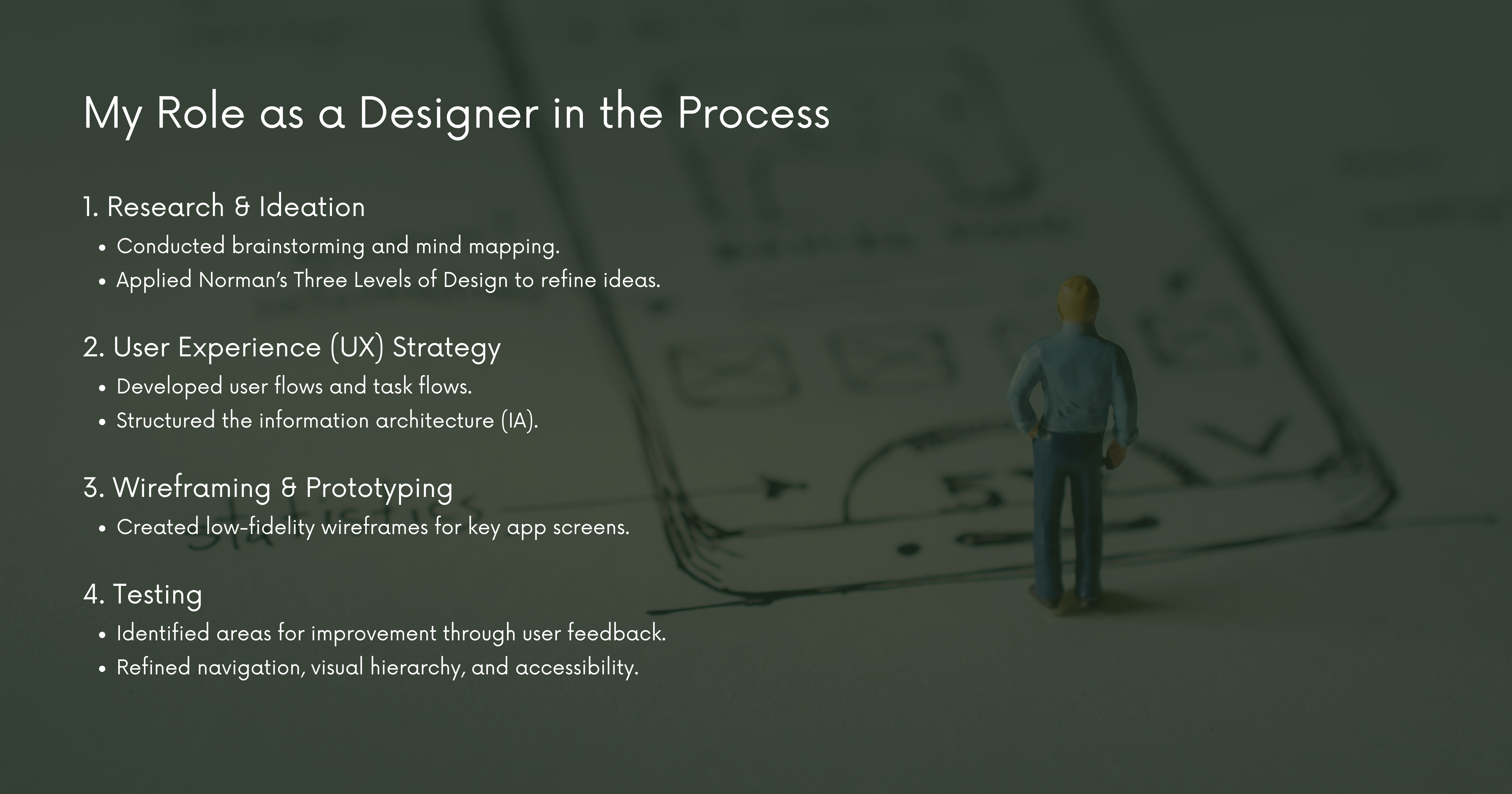
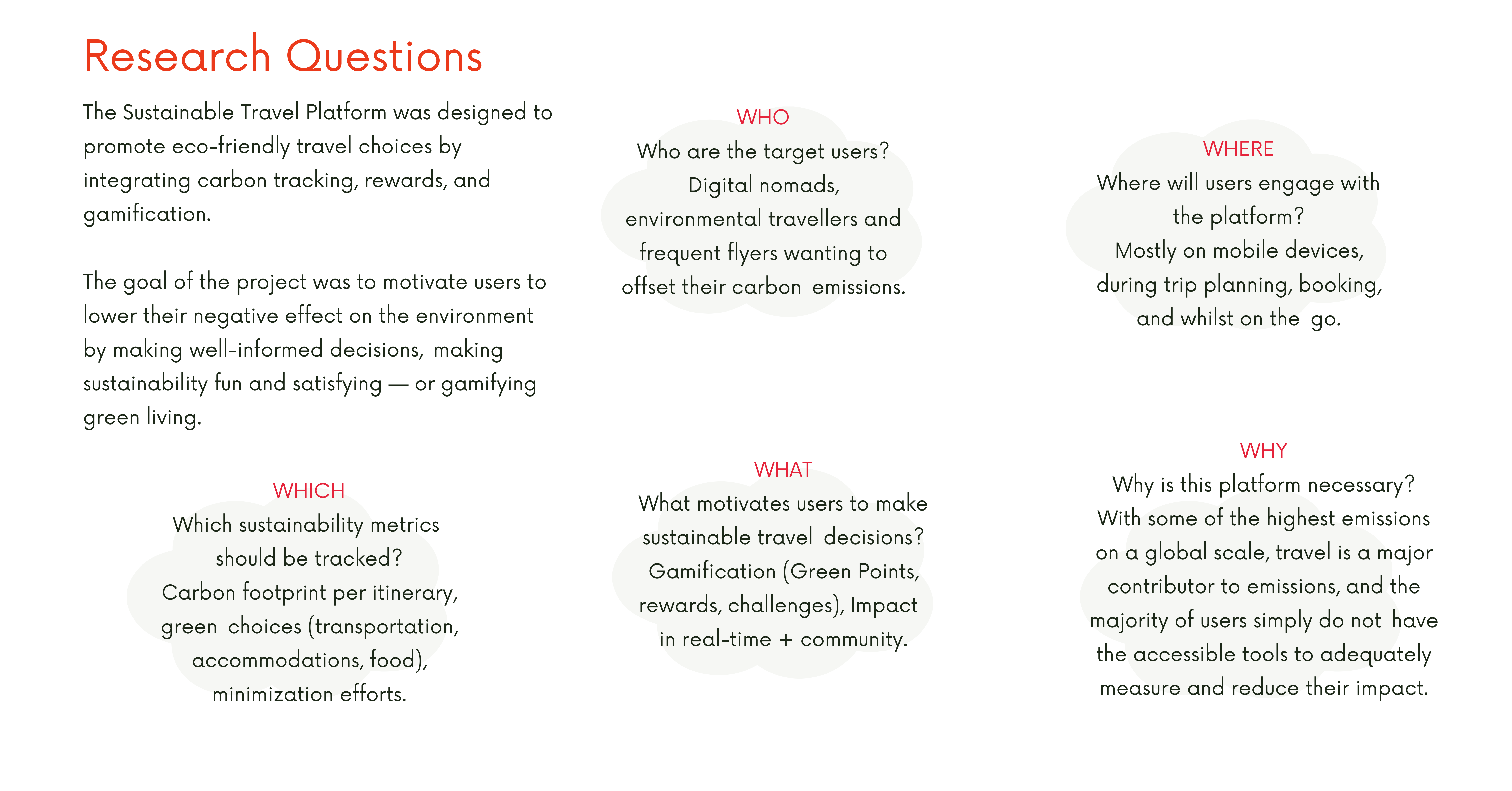
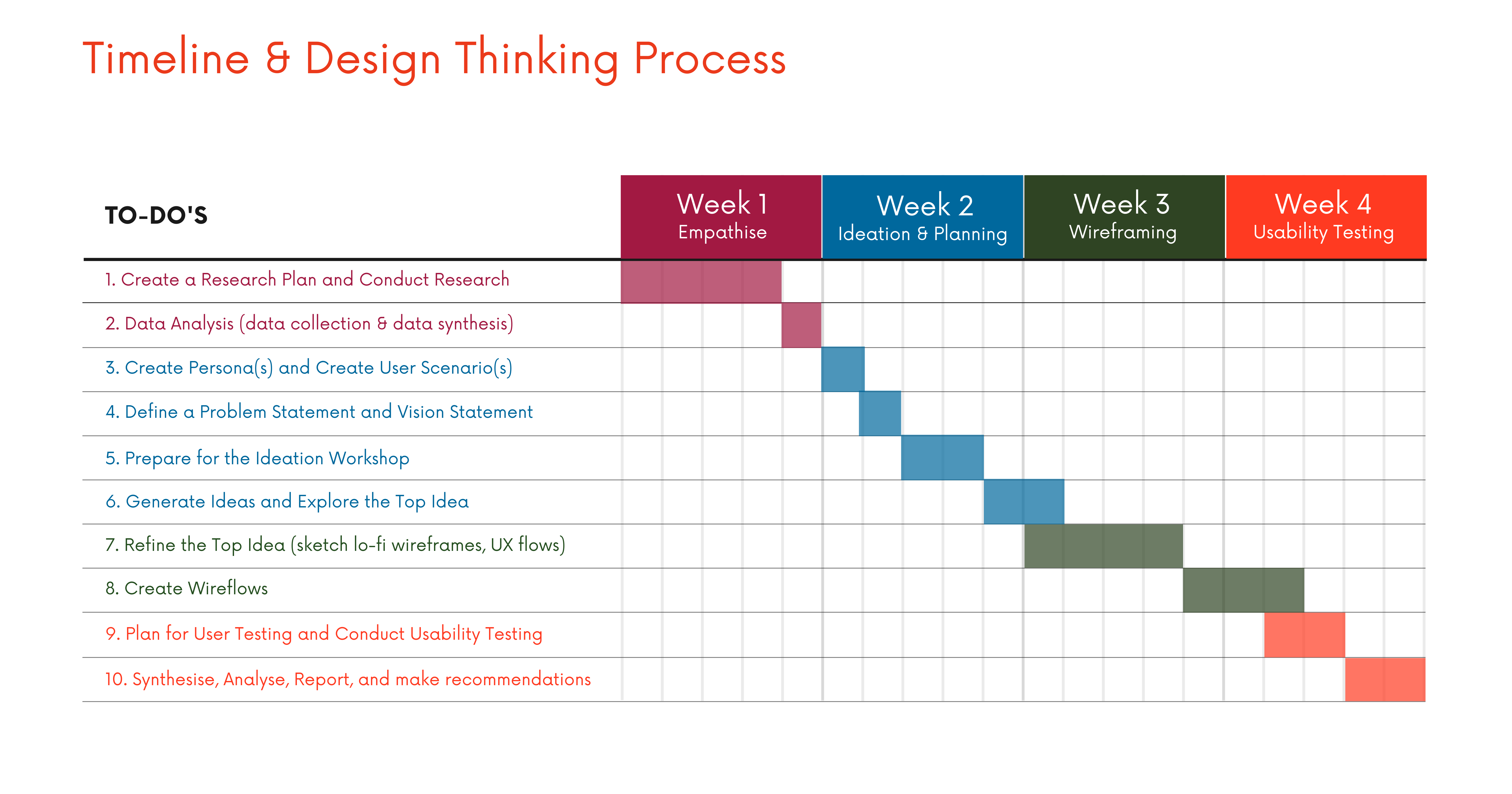
In this project I will follow the Design Thinking process for The Sustainable Travel App. The Design Thinking methodology is a user-centered approach that ensures the app is not only functional but also engaging, intuitive, and impactful.
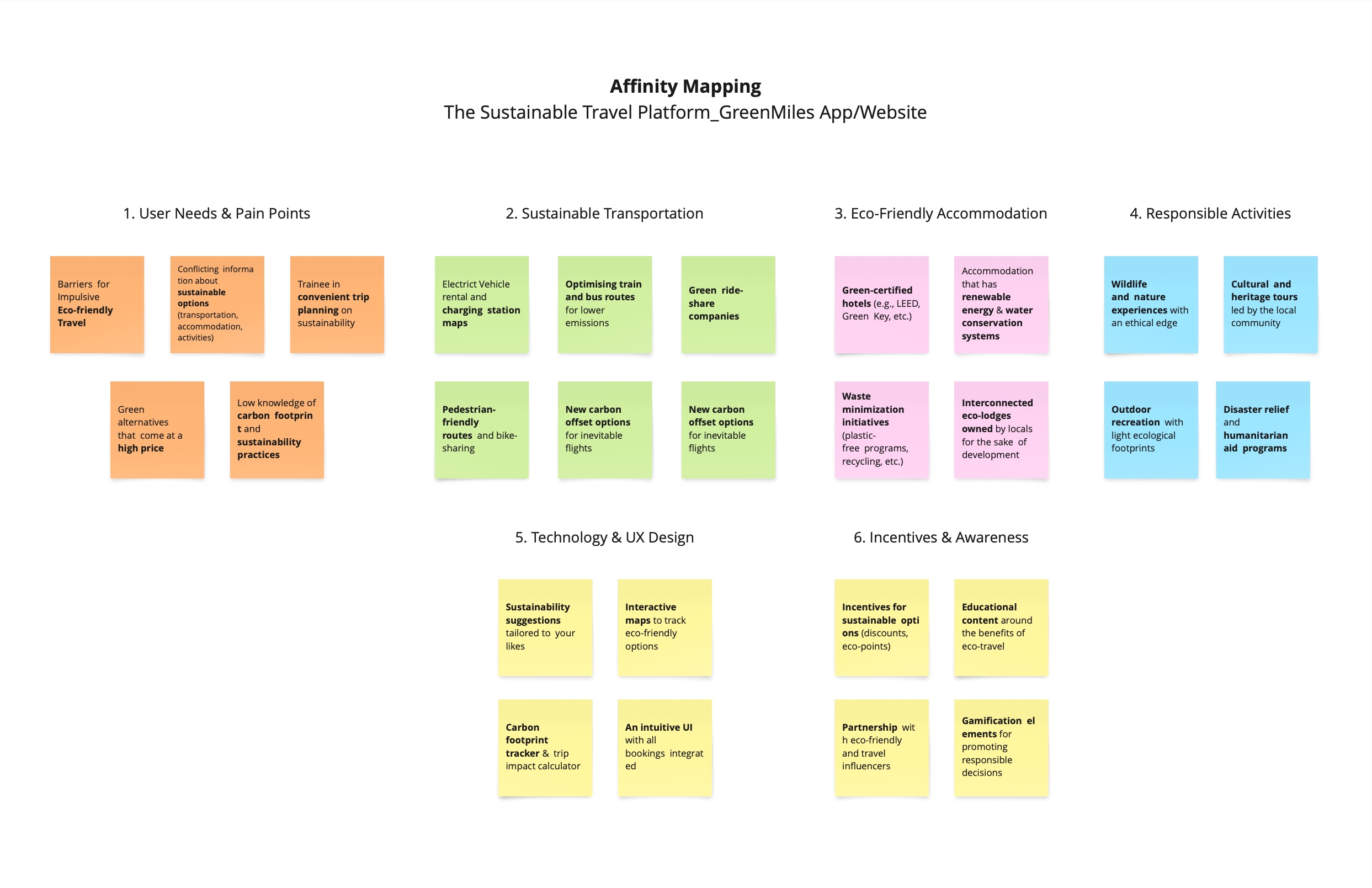
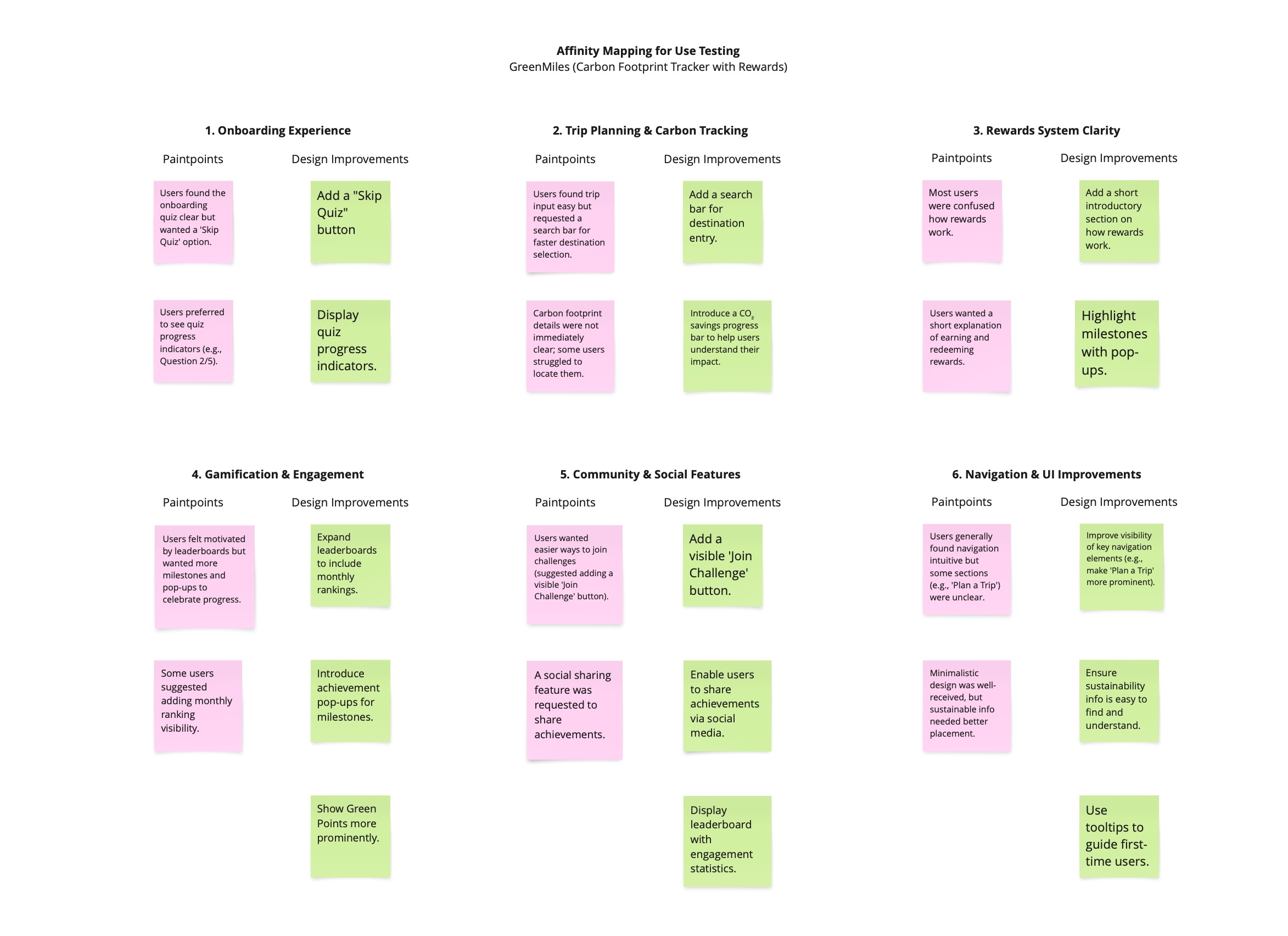
Data Analysis
To understand user needs, pain points, and expectations regarding sustainable travel, I employed both qualitative and quantitative research methods:
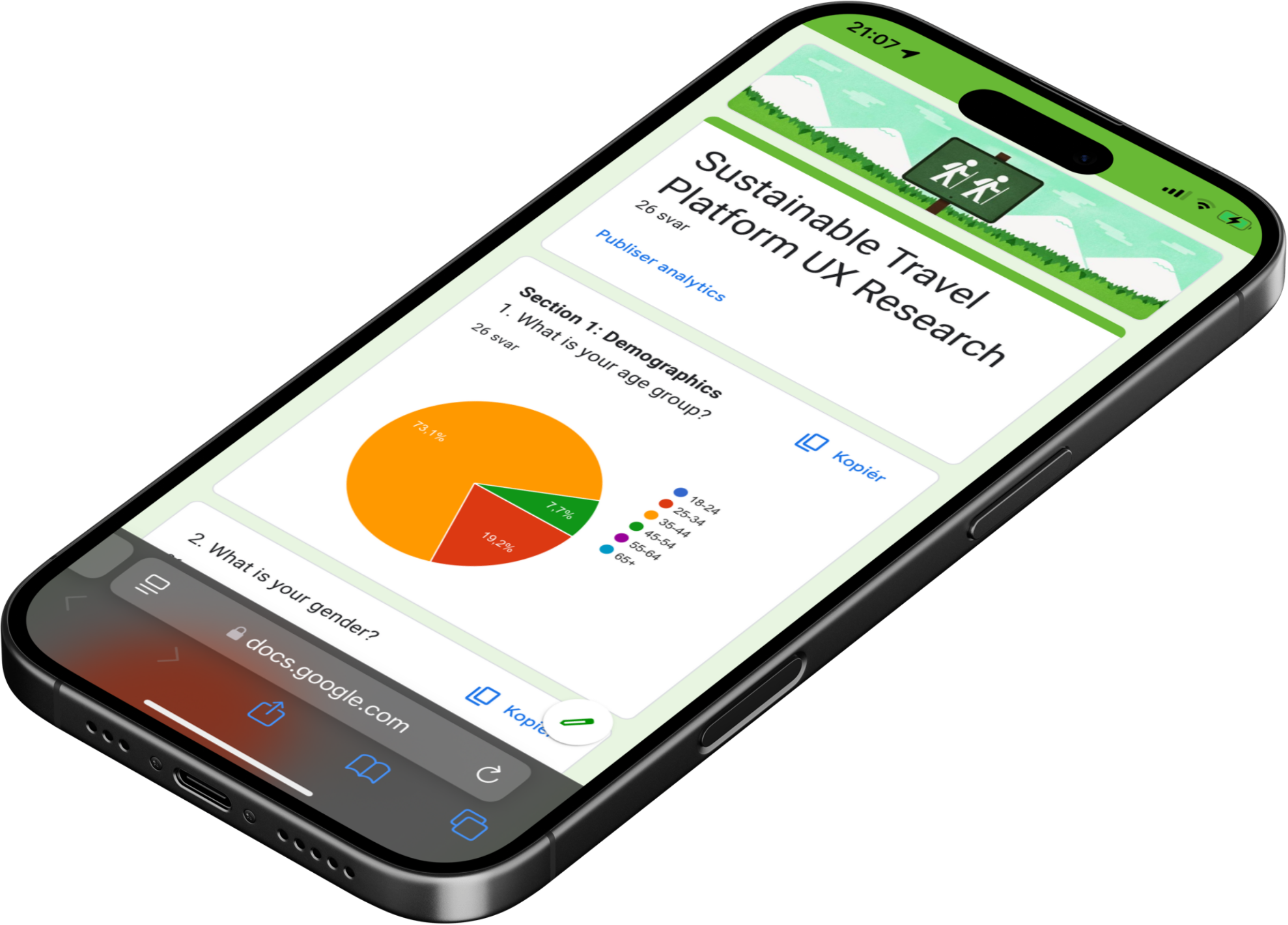
- User Surveys (Quantitative Data Analysis):
- Survey results were analyzed using Google Forms. Gathered insights on travel habits, sustainability concerns, and barriers to eco-friendly travel.
- Check the Survey Result here.
- User Interviews (Qualitative Data Analysis)
- 2 participants, in-depth exploration of motivations, challenges, and preferences.
- Check the Interview Result here.
A. Problem Statement
Our WHO (user) are WHAT (problem) because they WHY (reason). If we can solve this problem, it would impact (user) positively by/because (customer benefit). It would also benefit our business by/because (business benefit).
Our eco-conscious norwegian (user/who) want to travel the world sustainably, but they cannot find or book genuine eco-friendly options (problem/what) because of little transparency, personalization, and trustworthiness in sustainable travel choices (reason/why).
By solving this problem means eco-conscious travelers (user/who) can plan sustainable trips with ease, and eco-friendly choices are made without a second thought, as natural as breathing (customer benefit).
This will nudge more people to travel sustainably without the headache of navigating what’s actually sustainable (business benefit).
B. Vision Statement
We imagine a world in which travelers roam free while treading lightly on the planet— a world where every journey is sustainable, transparent, and profoundly meaningful.
We want to help people make sustainable travel decisions intuitively, enabling smart technology to connect them to genuinely conscious experiences.
We aspire to transform the landscape of tourism into something far more meaningful—one that protects the wilderness, sustains the local economy, and encourages a new breed of travellers to awaken a taste for adventure embedded deep within.
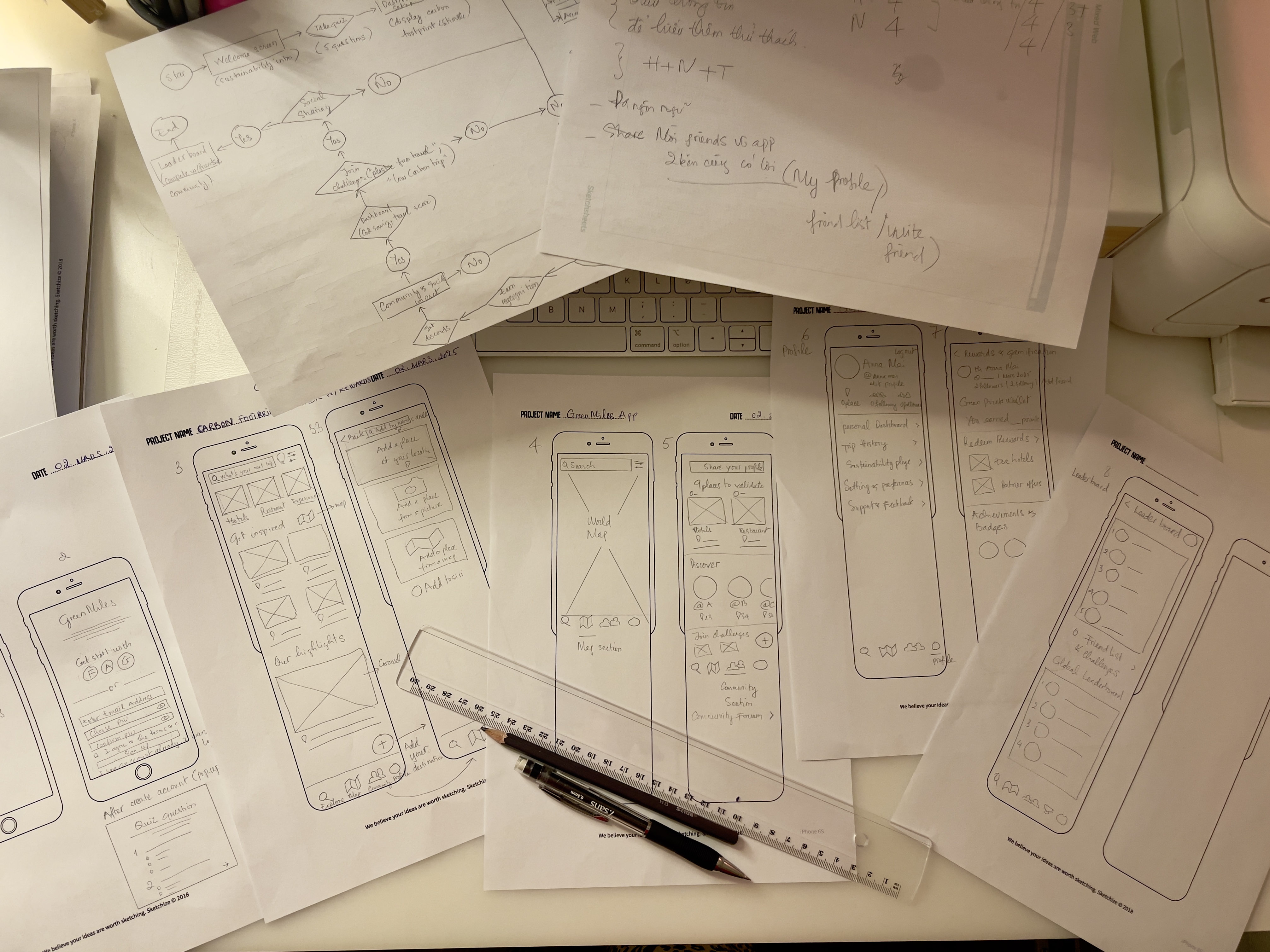
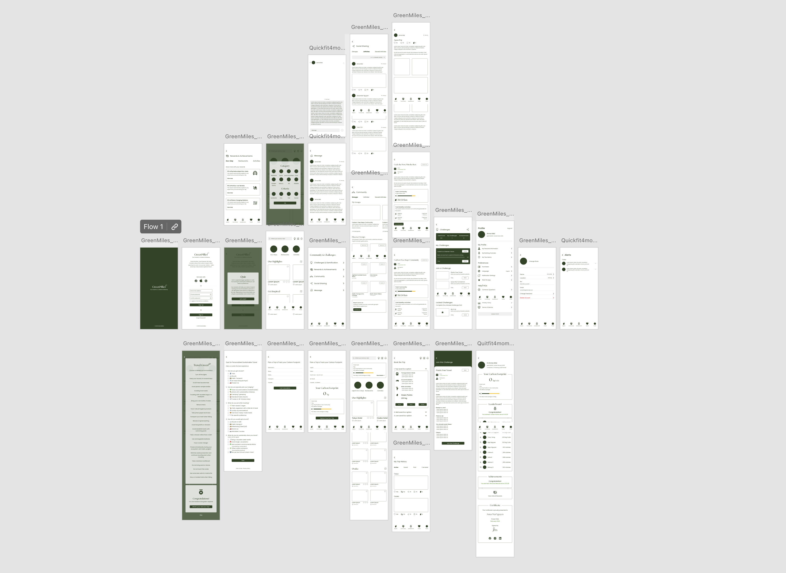
Lo-fi Wireframes Link (Digital)
Lessons from this project
This project was a huge learning experience, and these are the biggest takeaways that will stick with me:
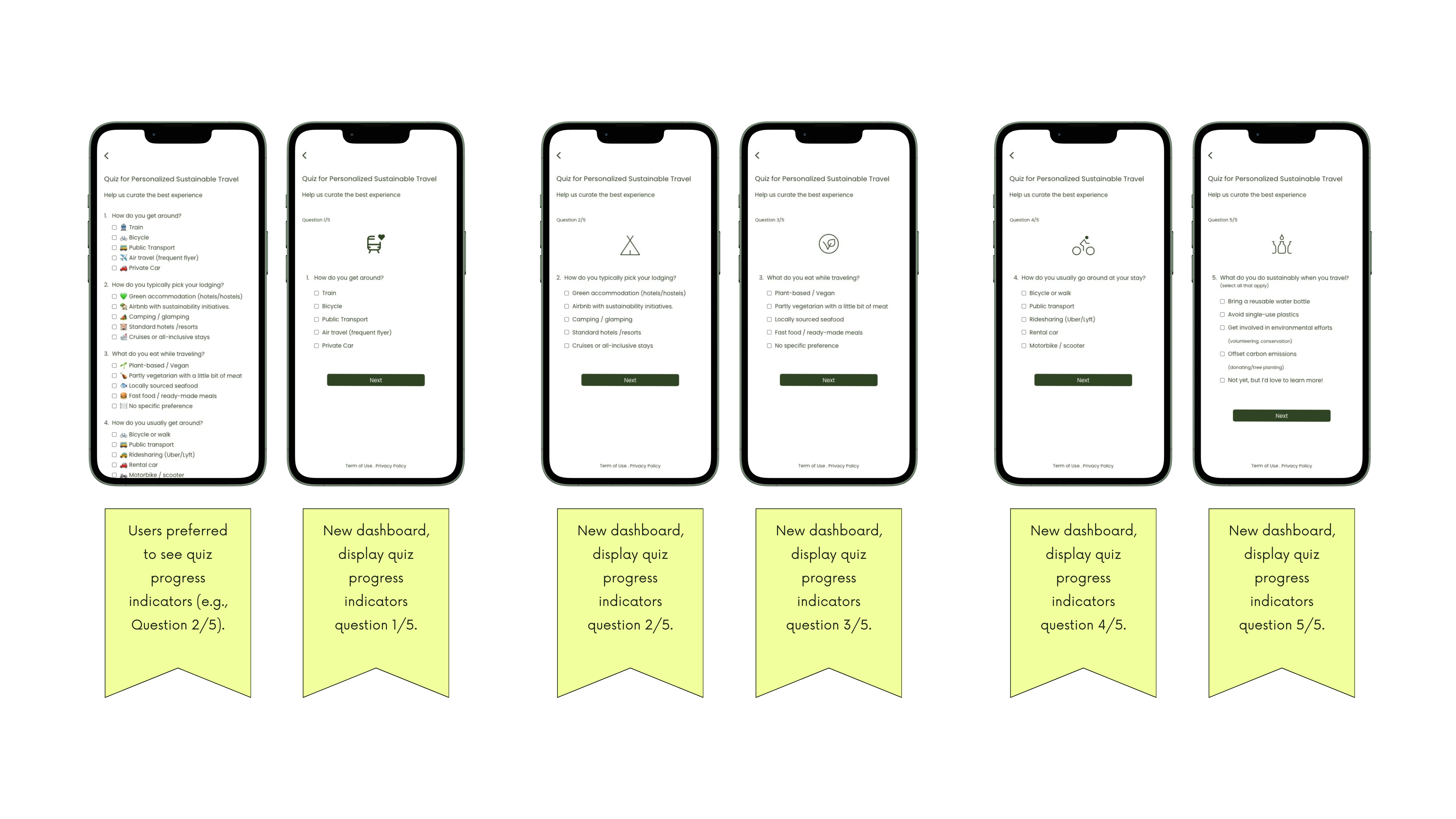
1. User Feedback is Everything
- What made sense to me as a designer wasn’t always clear to users.
- Seeing things from their perspective helped me grow and rethink how I approach design.
2. Keep it Simple
- Users want things fast and easy. They really do.
- Overcomplicated designs just slow them down and switch to another app.
3. Gamification Works
- Users love leaderboard, rewards, and challenges. It turns something like sustainable travel into a fun, engaging experience rather than just another task.
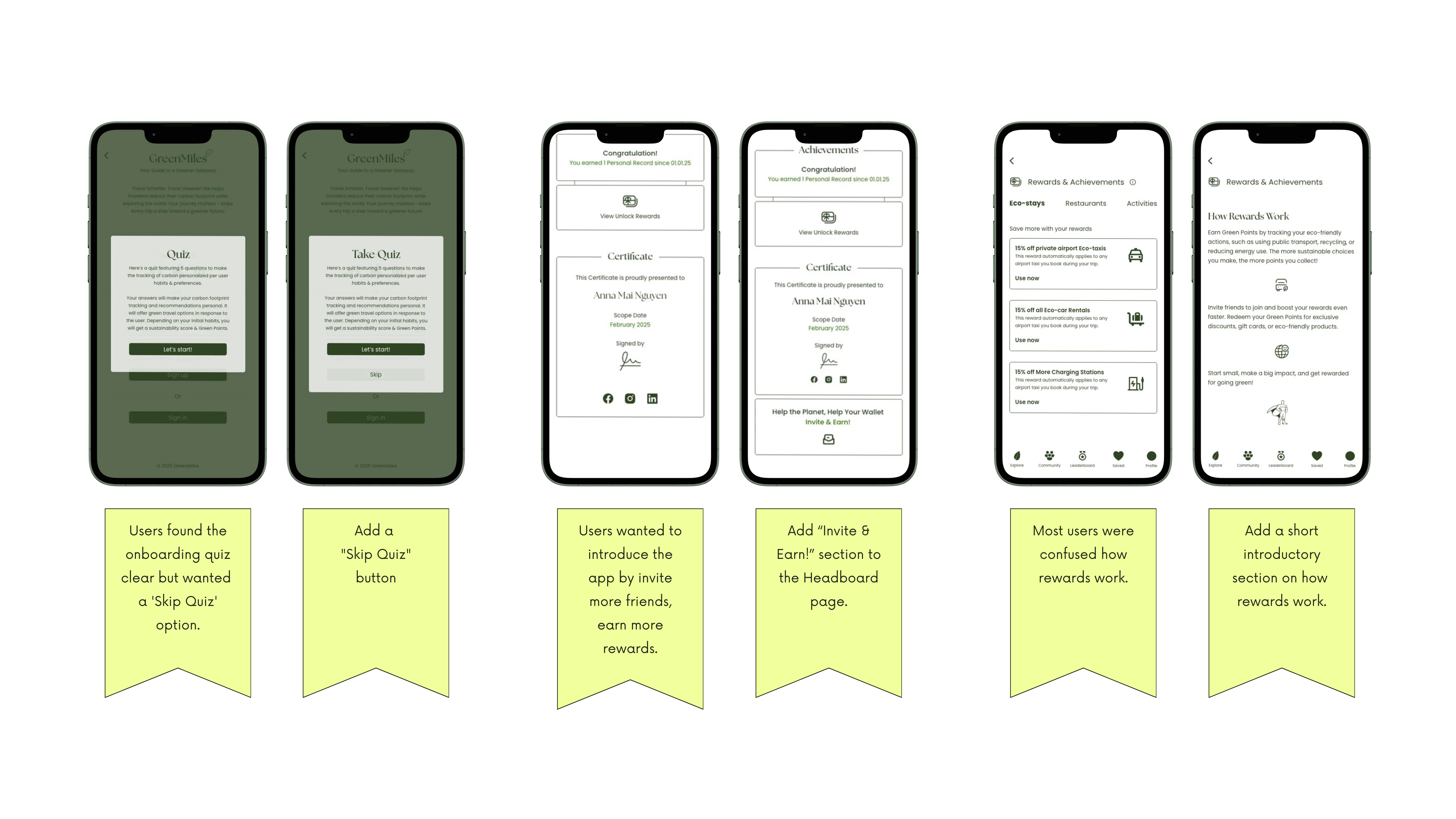
4. Even the Best Features Need Clear Explanations
- The rewards system confused users at first, but adding a quick guide made a huge difference.
- No matter how great a feature is, if users don’t understand it, they won’t use it.
5. Design is an Ongoing Process
- No design is perfect on the first try.
- Testing and refining based on real user feedback is what turns a good idea into a great product.
Conclusion
Working on the GreenMiles app has been a fantastic adventure that challenged me to look beyond aesthetics to build an experience that truly works for users. Through user testing, feedback, and iteration, I learned the crucial importance of simplifying complex features, engaging for sustainability, and just adding clear explanations wherever needed.
This project served as reminder that good UX is not only about making an app visually appealing, but about making the app a well-functioning and enjoyable platform. Watching users get excited about tracking their carbon footprint, earning rewards, and participating in challenges made all the effort worthwhile.
While there’s always room for improvement, I’m proud of what I’ve learned and how it has shaped me as a UX designer. Design is never “finished” — it is always a process of learning, refining, adapting. I am excited to carry these learnings into my future projects!take these lessons forward in my future work!

