TASK 1 – The similarities and differences between Suprematism and Constructivism
Constructivist art and Suprematist art are both movements that emerged in Russia in the early 20th century (1917 – 1922), but they have different philosophies and visual styles.
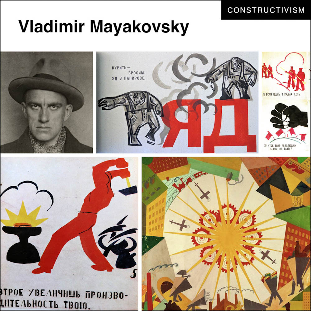
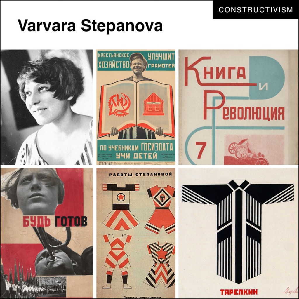
Constructivist art, which was prominent after the Russian Revolution of 1917, which originated in Moscow, Russia by Vladimir Tatlin and got most of its ideas from Suprematism, Cubism and Futurism. Focused on the idea of “construction” and the use of industrial materials and techniques. It emphasized practicality, functionality, and the integration of art into everyday life. Constructivist artists often created geometric, abstract compositions and experimented with new materials like metal, glass, and plastic.
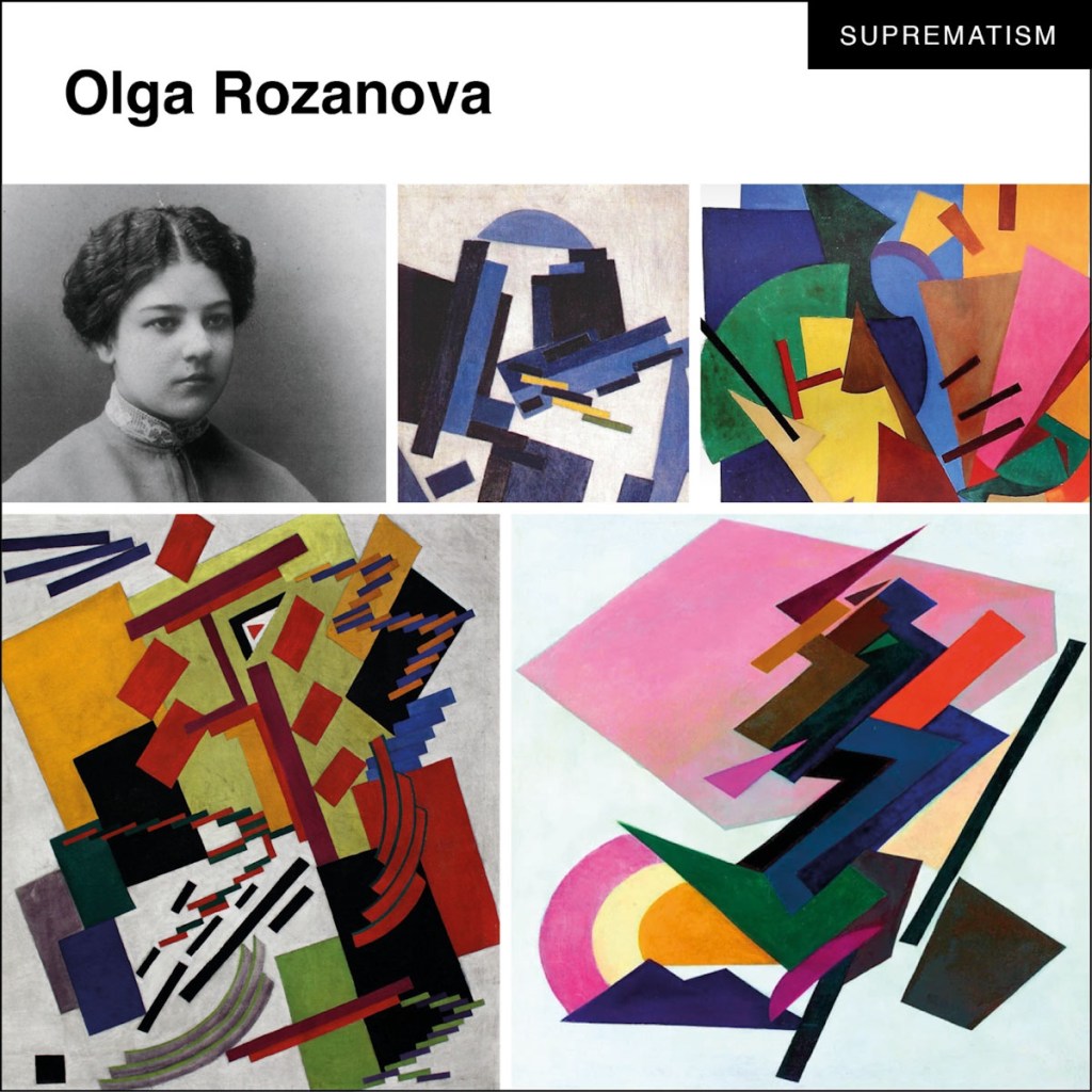
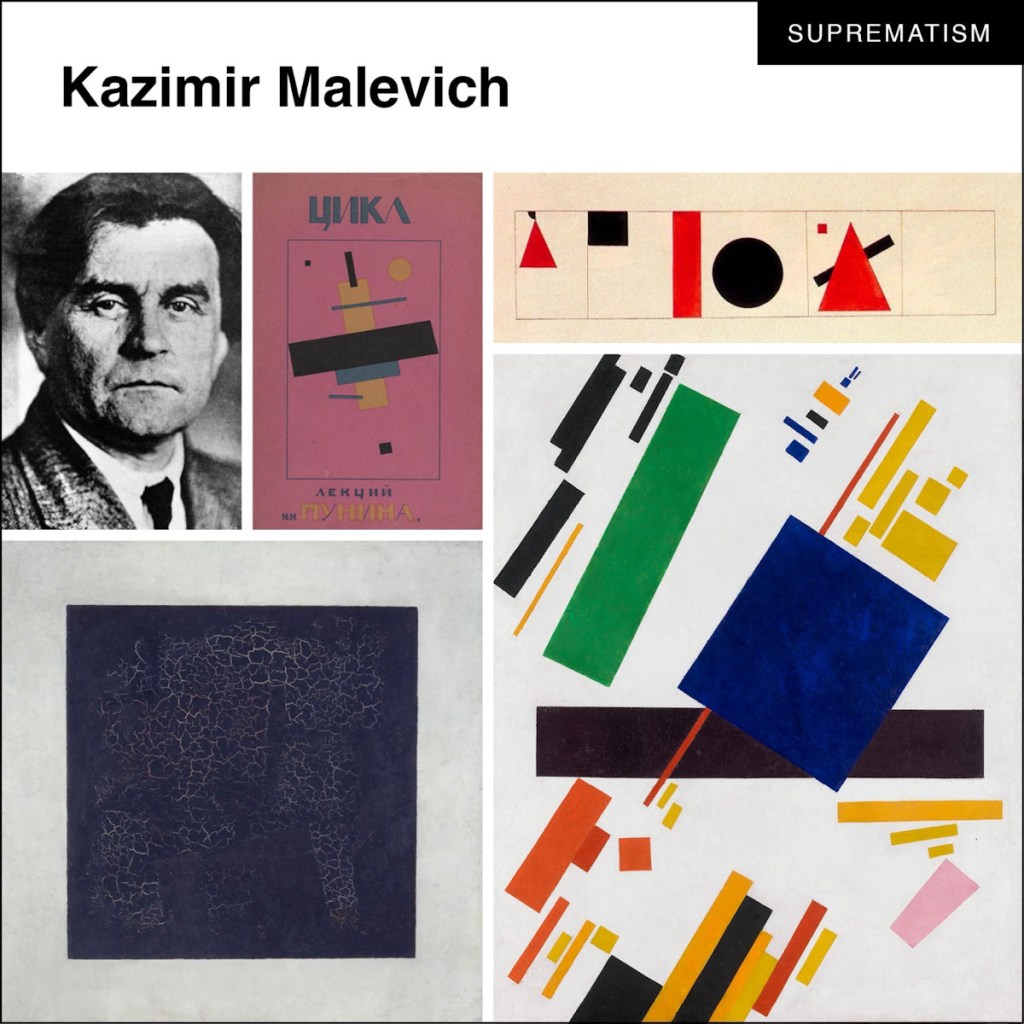
On the other hand, Suprematist art, pioneered by artist Kazimir Malevich (1913), was characterized by a more spiritual and abstract approach. Suprematist artists sought to express pure feeling and perception through non-representational forms and colors. This art movement consisted mainly of basic geometric shapes and forms including lines, rectangles, circles, the cross and squares and made use of a limited range of colours, to create compositions that aimed to evoke a sense of transcendence and universality.
Suprematism did not rely on any realistic images. “Sensitivity is the only thing that matters”, wrote Malevich, “and it is expressed by absolute forms: the rectangle, the triangle, the circle, the cross.”
In summary, while Constructivist art focused on practicality and the integration of art into daily life, Suprematist art aimed to evoke spiritual and universal concepts through abstract forms and colors.
How do we connect these movements in art to graphic design?
Moving away from pictorial imagery and focusing on the construction of concrete elements of colour and shape resulted in the visual form – in its purest, simplest form – becoming the content itself during suprematism.
Suprematism is not about a feeling, but of a sensation. Constructivism emerged when a series of artists rejected the idea of “art for art’s sake” and began devoting themselves to the practical arts of industrial design and other visual communications.
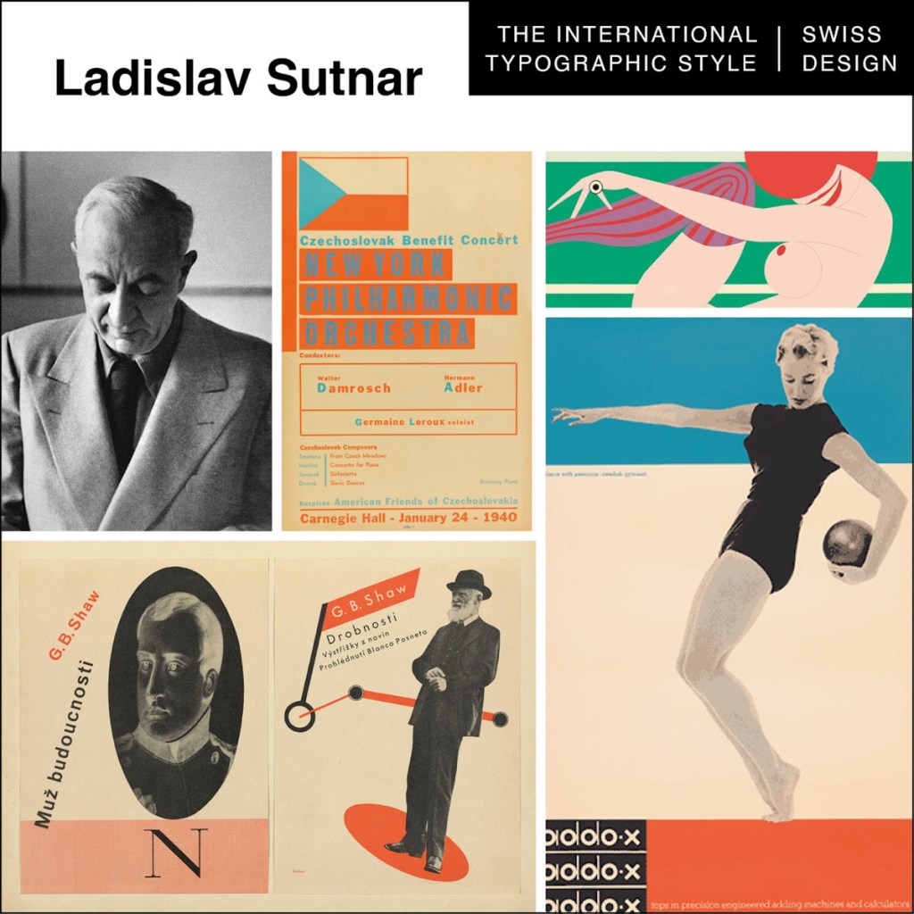
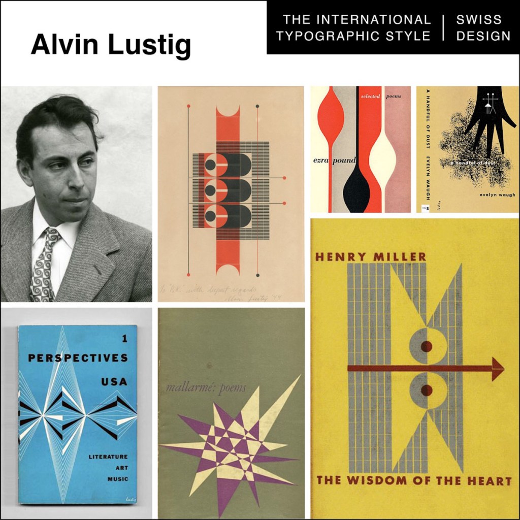
1. International Typographic Style/Swiss Style (ca. 1950-late 1960s)
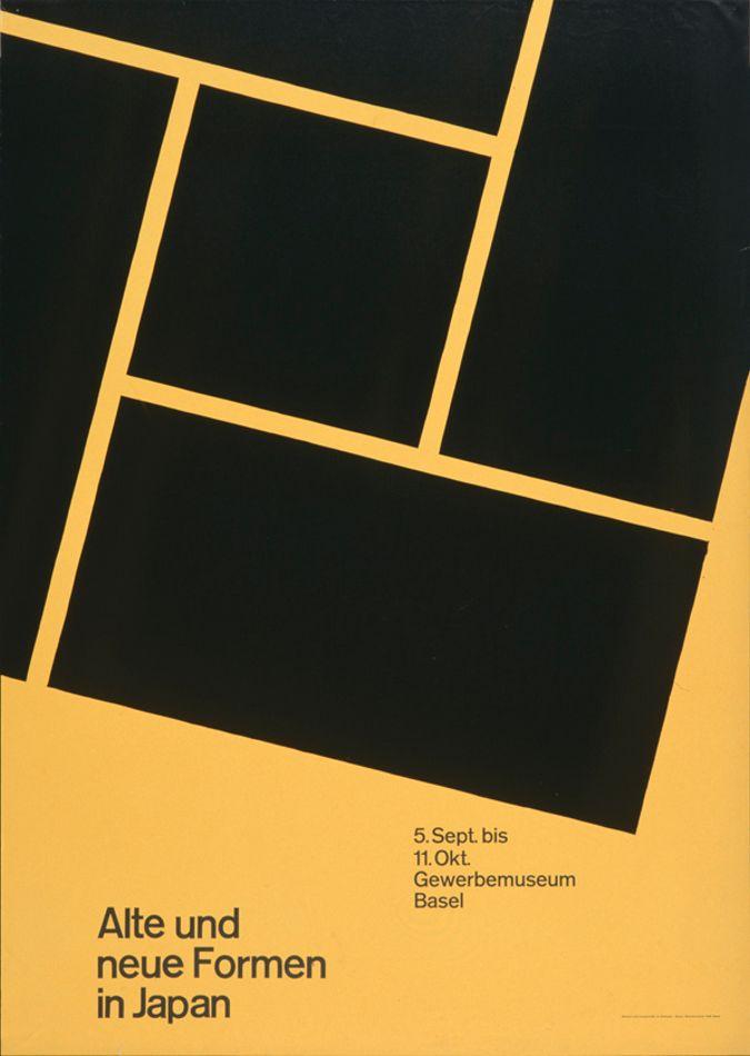
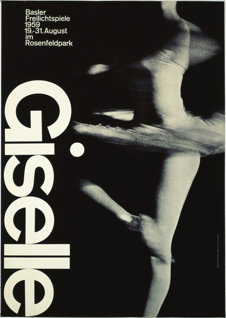
International Typographic Style (ITS), also known as the Swiss Style, emerged in Switzerland and Germany in the 1950s that values and focuses on cleanliness, readability and objectivity. It’s became known for design that emphasized objective clarity through the use of compositional grids and sans serif typography as the primary design material (or element). Swiss style (also Swiss school, Swiss design) is a trend in graphic design, formed in the 1950s – 1960s under the influence of such phenomena as the International Typographic Style, Russian Constructivism, the tradition of the Bauhaus school, the International Style and classical modernism.
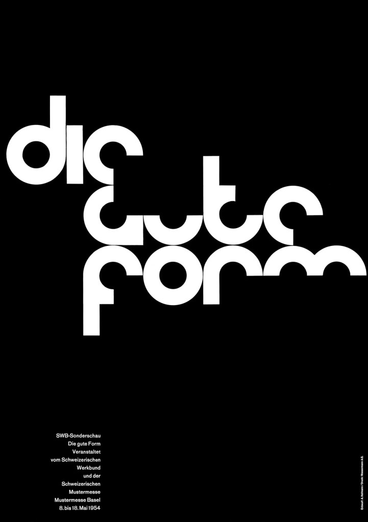
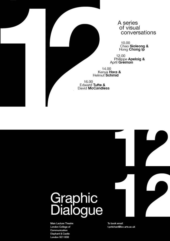
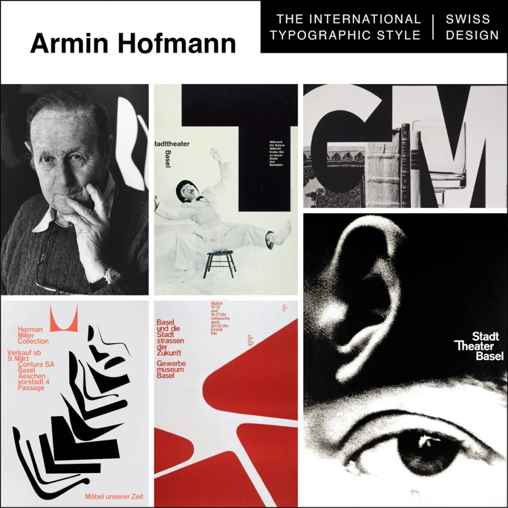
The visual characteristics of this style include:
- Asymmetrical organisation of design elements on a mathematically constructed grid to achieve unity.
- Objective photography (neutral and unbiased).
- Copy that presents visual and verbal information clearly, and factually (no exaggerated claims like copy used in propaganda or commercial advertising).
- The use of sans-serif typography (preferably aligned to the left with a ragged right margin).
2. Pop Art Style (ca. 1950-1970)
Pop art is an art movement that emerged in the United Kingdom and the United States during the mid- to late-1950s. The movement presented a challenge to traditions of fine art by including imagery from popular and mass culture, such as advertising, comic books and mundane mass-produced objects. One of its aims is to use images of popular culture in art, emphasizing the banal or kitschy elements of any culture, most often through the use of irony. It is also associated with the artists’ use of mechanical means of reproduction or rendering techniques. In pop art, material is sometimes visually removed from its known context, isolated, or combined with unrelated material.
The movement was in close sync with the globalisation of pop music, commercial culture and ideas, such as the rise to fame of Elvis, Marilyn Monroe, The Beatles and the Rolling Stones. Pop Art was a reaction and riot against the traditional views, approaches and ideas into what was considered to be art. The popular subject matter of the time took on a drastic metamorphosis from the norms which included themes of idealism, mortality, hierarchy and history; but instead focused on everyday life. It is due to its use of commercial imagery at times within designs, that Pop art became one of the most recognisable and iconic styles of the modern era.
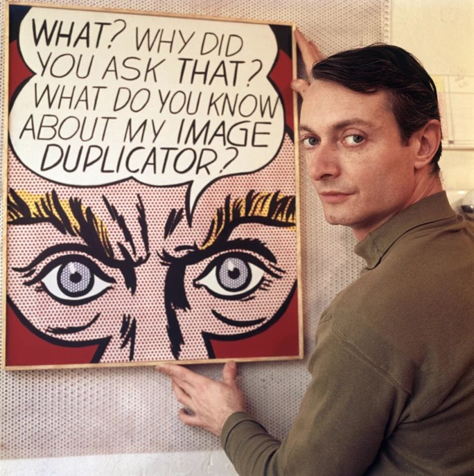
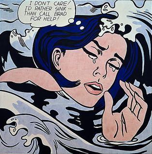
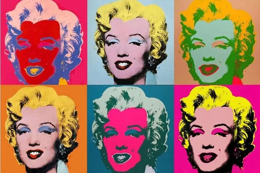
Pop art drew inspiration from every and anything which was going on at the time such as Hollywood movies, advertising, packaging for consumer products, pop music, celebrities and comic books, then incorporated them into its imagery. Some key pop artists include Roy Lichtenstein, Claes Oldenburg and Andy Warhol.
3. Psychedelic Poster Style (ca. 1960-mid-1970s)
Psychedelic Design is an art form that tends to have intense colours, free-flowing lines, and kaleidoscopic patterns. It was created in San Francisco in the 1960s by artists who belonged to the hippie movement, first appearing as posters for rock concerts being played around the city. They included Wes Wilson, Stanley Mouse, Alton Kelly, Rick Griffin, Bonnie MacLean, and Victor Moscoso, who was perhaps the most prolific of the group, creating scores of original rock posters in quick succession.
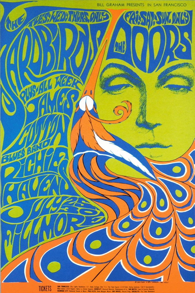
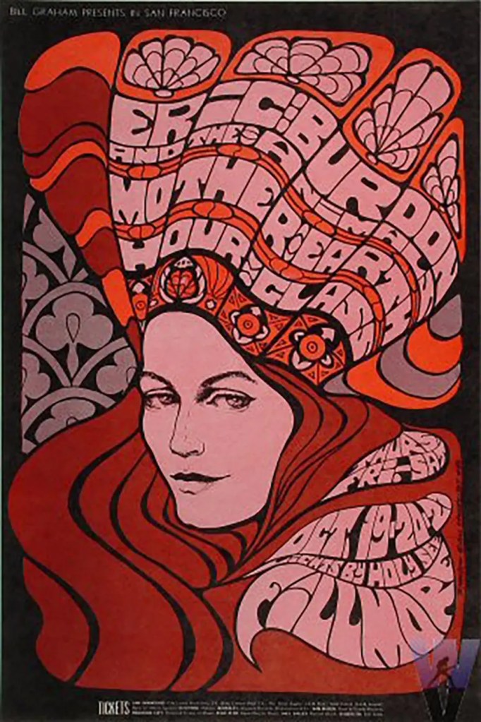
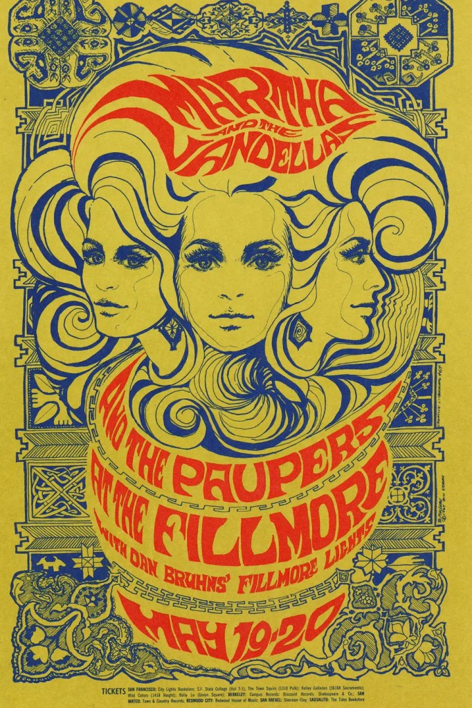
Psychedelic design emerged from the hippie communities of San Francisco in the 1960s. It used vivid colour, spontaneous shapes and lines, and bombastic imagery that seized the attention of anyone witnessing it. The style remains popular today, and while it’s less common for commercial purposes, graphic designers can still use its alluring aesthetic to great use, in the form of eye-catching adverts, posters, brochures, and more.
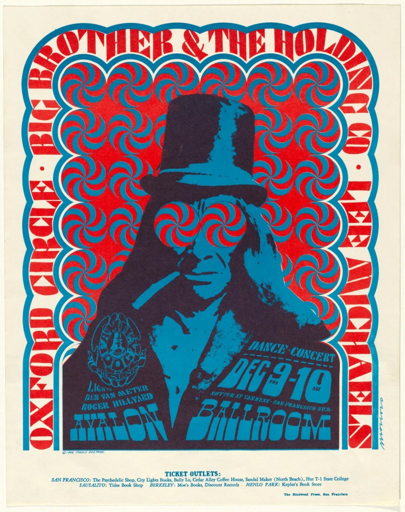
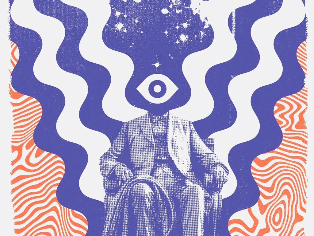
The visual characteristics of this style include:
- Bright colours—colours are vivid and eye-catching.
- Surreal imagery—things get weird on LSD, and this can be reflected in odd, warped images that twist and swirl.
- Kaleidoscope patterns—shapes and patterns repeat around a central point, and seem to fall into each other.
- Winding lines—you’ll rarely find anything straight or boxy.
- Extreme stylization—images are intensely stylized to give them an otherworldly effect.
- Collages—images laid over other images are commonly used to create a jumble of meanings.
- Busy—edge to edge, busy designs that scream for your attention. They are filled with spiral patterns, flowers, curves, winding and flowing lines. This is the complete opposite of minimal graphic design.
- Weird typography—crazy typography that is fat, curly, looping, and tough to read.
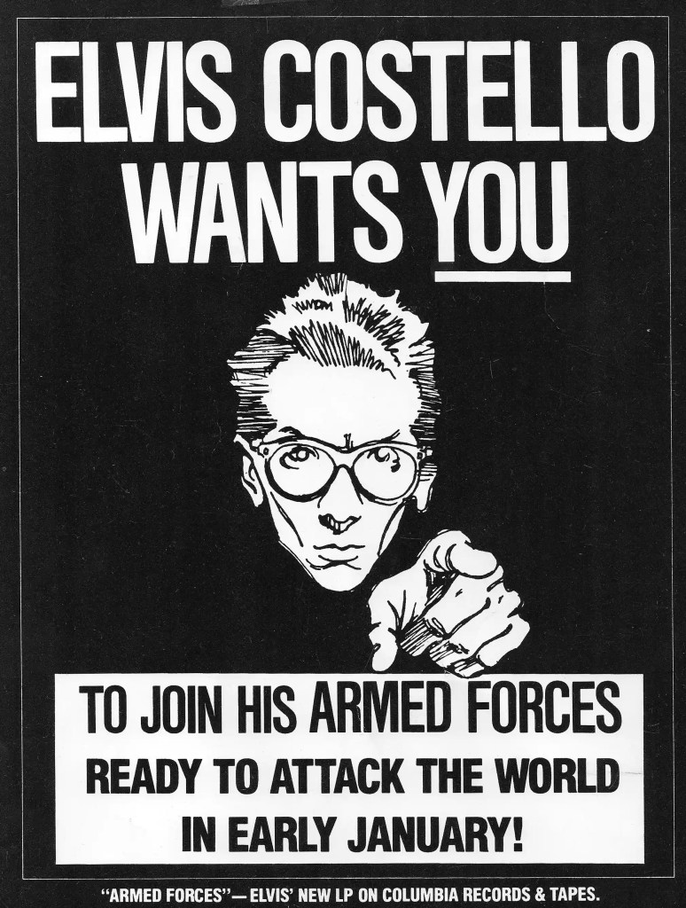
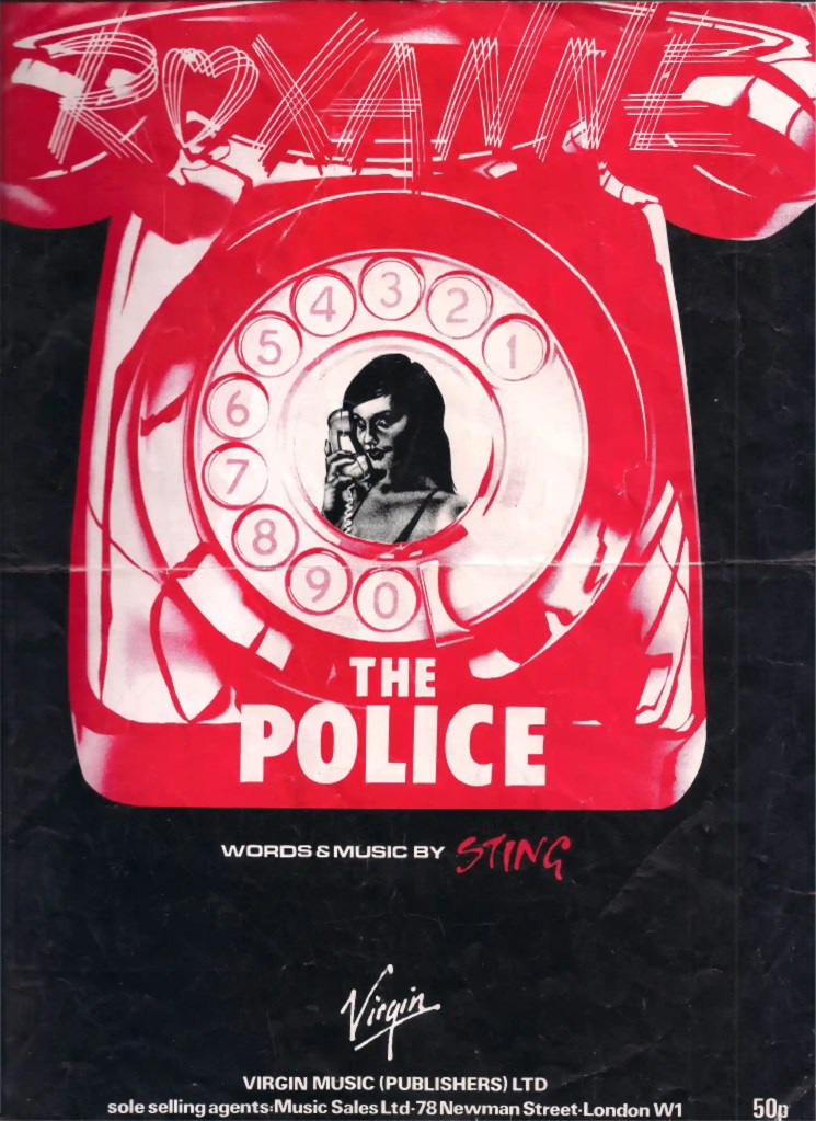
4. New Wave/Punk Style (ca. 1970-mid-1980s)
New Wave Graphics Are the Most Influential Designs You’ve Probably Ignored. The slippery, unashamedly pop-leaning genre changed everything—graphics included. “New wave created a better understanding of the power of graphic design to shape language, convey meaning, and communicate.”
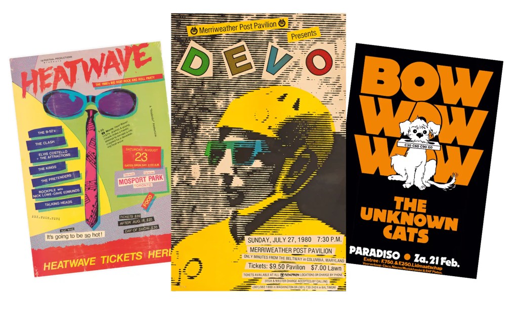
Photograph: All images courtesy of Andrew Krivine and Pavilion Books
In the early to mid-’80s, the so-called New Wave typography was a mix of styles that combined traits of Swiss Modernism, Postmodern contrasts and harmonies and lots of geometric shapes and isometric patterns. Typogram, one of New York’s digital typesetting service bureaus, produced this “ePage Electronic Graphic Services brochure” in 1988, in the early days of desktop publishing, designed by KODE. What this design shows is how a new technology helped define the style of a time.
Some characteristics of the New Wave graphic design are bold contrasting colours, repetition through the artwork, pixelated type and a broken grid.