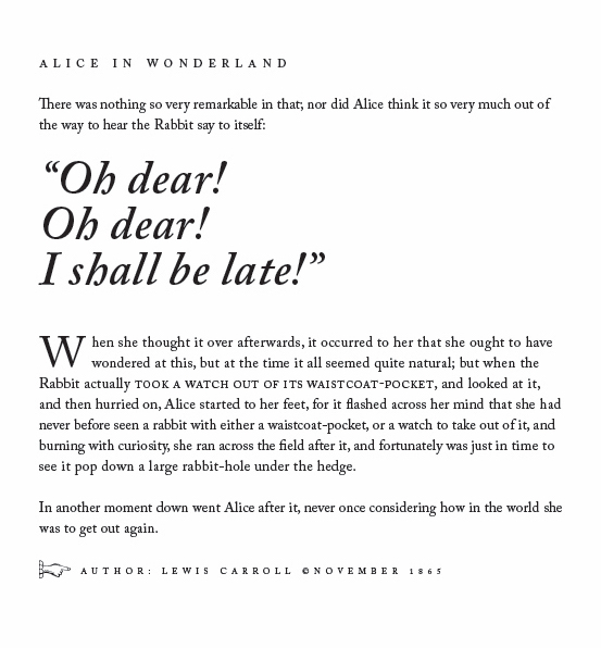
1. TYPOGRAPHY 1
After I’ve gone through the course “Typography Part 1” by Nigel French on LinkedIn Learning, I replicated the text layout below in InDesign using leading, kerning, a drop cap, small caps and glyphs. Here is my work.
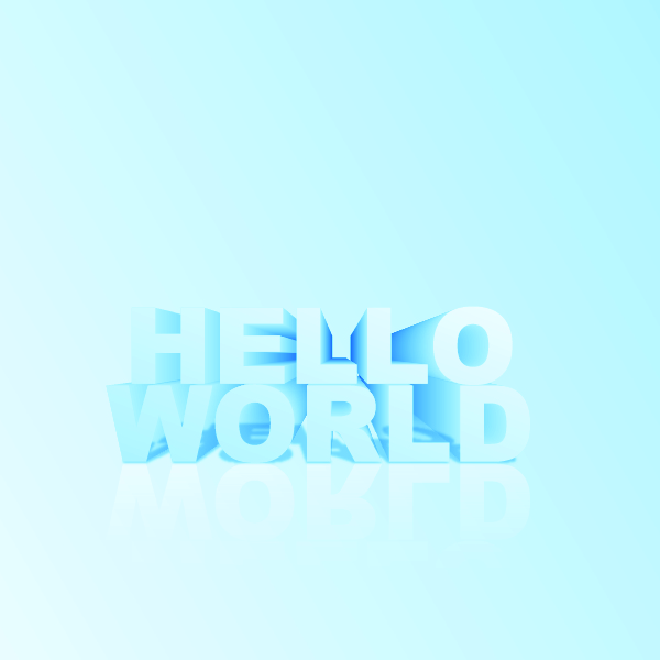
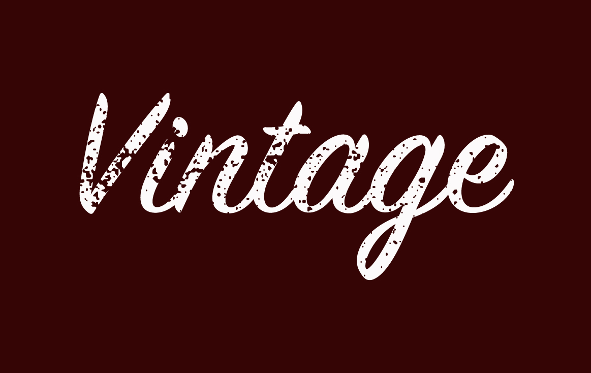
2. TYPOGRAPHY 2
2.1. Create an overlapping typography effect in Adobe Illustrator.
2.2. Create a 3D text design in Adobe Illustrator.
2.3. Apply textures to text in Adobe Illustrator.
3. COLOUR THEORY
Applying a colour palette to a design. After going through the concept design for the book cover “The Seven Dials Mystery”, I choosed four colours which are BLACK, RED, DARK GREY and WHITE. Here is my colour palette of the book cover.

We have three different sections in colour palette: Primary colours, Secondary colours, Accent colours. And because the content of the novel is mysterious, deadly and suspenseful, so I have chosen the color palette in the order below.
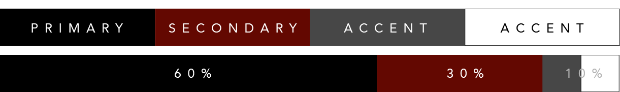
- The Primary color is BLACK, reminds about mystery, death, evil, and emptiness.
- The Secondary colour is RED, represents aggression, strength, and danger.
- The Accent colours are DARK GREY and WHITE are the background colours to make the BLACK and the RED colours stand out and mysterious.
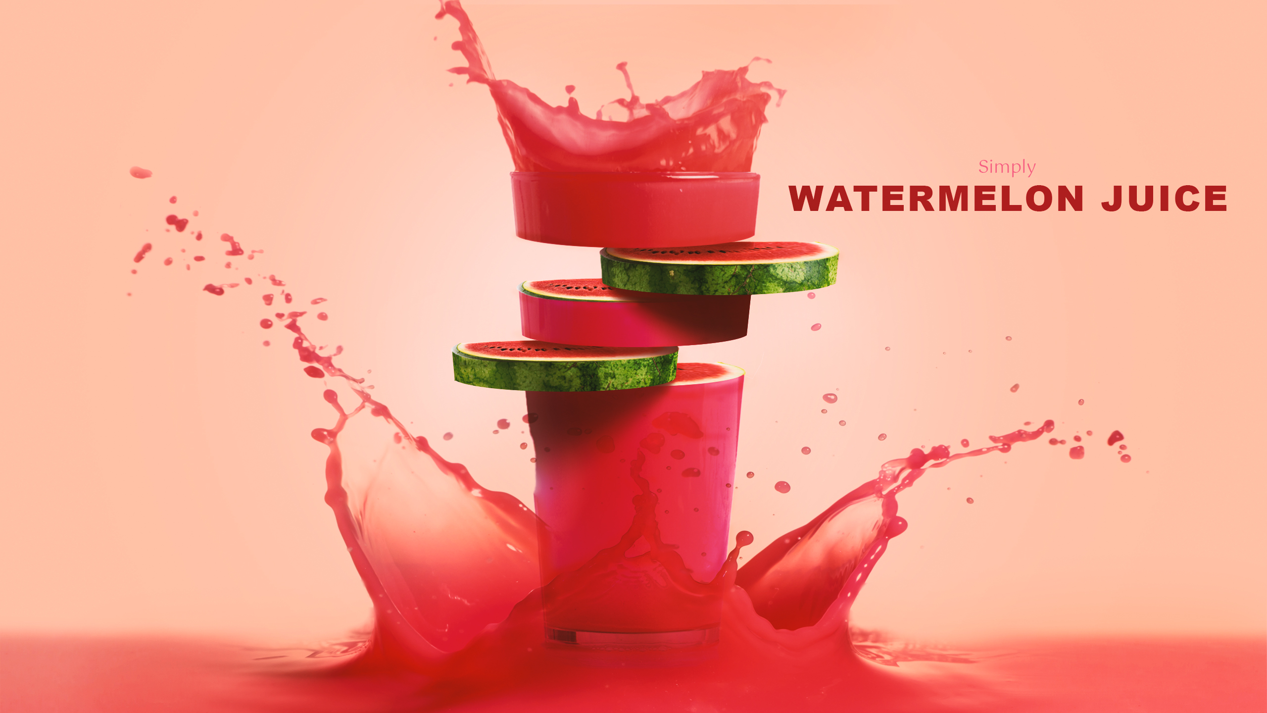
4. IMAGES
This task is about sourcing and modifying stock images to create a brand-new design. Following the tutorial Fruit juice photo manipulation effect by Tutvid, I created my own version: watermelon juice. Photos sourcing from “freepik.com”. And here is my work.